NAWAK
Surrealist Library
A surrealist project blending literature and experiences to awaken the subconscious.
Project Overview
Nawak is a conceptual brand identity and digital experience designed for a fictional surrealist library. Created as the final Master's project in Graphic Design, this initiative aimed to merge literature, art, and personal exploration into a cohesive brand ecosystem.
Rooted in surrealist techniques and guided by the movement’s legacy of spontaneity and subconscious exploration, we designed a multisensory brand experience that includes naming, visual identity, physical space design, editorial work, web presence, and merchandise. Every element—from the logo’s symbolic lips to the fluid visual language—was carefully crafted to reflect the emotional and psychological depth of surrealism.
As a multidisciplinary design team of four, I acted as the lead on several areas including brand direction, visual identity supervision, website UI/UX, front-end development, and the full creation of the packaging and editorial system.
Timeline
6 months
Role
Research & strategy (shared)
Creative direction (shared)
Visual identity design (shared)
Web design & development (solo)
Editorial design (shared supervision)
Platform
Brand physical + digital spaces
Print
Responsive web
Team
4 Graphic Designers
Jury of professors and external reviewers
Tools
Figma
Adobe Illustrator
InDesign
Photoshop
Visual Studio Code
HTML & CSS
Status
Conceptual (not publicly deployed)
Contribution
- Naming and brand strategy
- Visual identity system
- Editorial & print design
- Packaging design
- Web design and front-end development
- Merch & spatial design concepts
Problem Context
The project brief challenged us to create a brand for a new surrealist library that would go beyond selling books—it needed to be an immersive, introspective experience that paid homage to the surrealist movement while engaging a modern audience.
We were asked to imagine the space not only as a cultural venue, but as a place for emotional and artistic self-discovery—hosting workshops, forums, and artistic encounters built around classic surrealist techniques like exquisite corpse, automatic writing, and cubomania.
Core Challenge
How might we design a cultural space and identity that embodies surrealism, not just aesthetically, but experientially, while remaining accessible and relevant to contemporary audiences?
Research
Concept & Strategy
To define the brand’s positioning, we conducted extensive research into the surrealist movement and its techniques, values, and figures. We explored classic and modern surrealist spaces, publications, and collectives to identify gaps and opportunities.
Strategic Pillars:
📍
Value Position
A space where visitors can reconnect with themselves through surrealist art, literature, and collective experimentation.
🌱
Core values
· Subconscious
· Multidisciplinary
· Playful
· Extravagant
🔍
Mission
Offer unique products and emotional experiences tied to surrealism, providing tools for personal expression.
👁️
Vision
Become a leading destination for surrealist exploration, supporting emerging artists and encouraging personal creative growth.
🎤
Brand voice
· Surprising
· Expressive
· Culturally rich
📺
Audience insight
People interested in creativity, emotion, personal exploration, and experimental art—regardless of artistic background.
The brand promise, “Le surréalisme toujours plus loin” (Surrealism always goes further), guided our tone and visuals. This phrase encapsulates the desire to go beyond surface-level aesthetics and tap into deeper emotional and subconscious layers.
Naming & Visual Identity
We named the brand Nawak, a playful French slang term expressing absurdity or surprise. The name paid tribute to surrealism’s French origins and aligned with our expressive, multidimensional brand tone.
From there, we built a visual identity rooted in symbolic distortion.
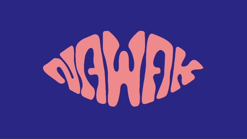
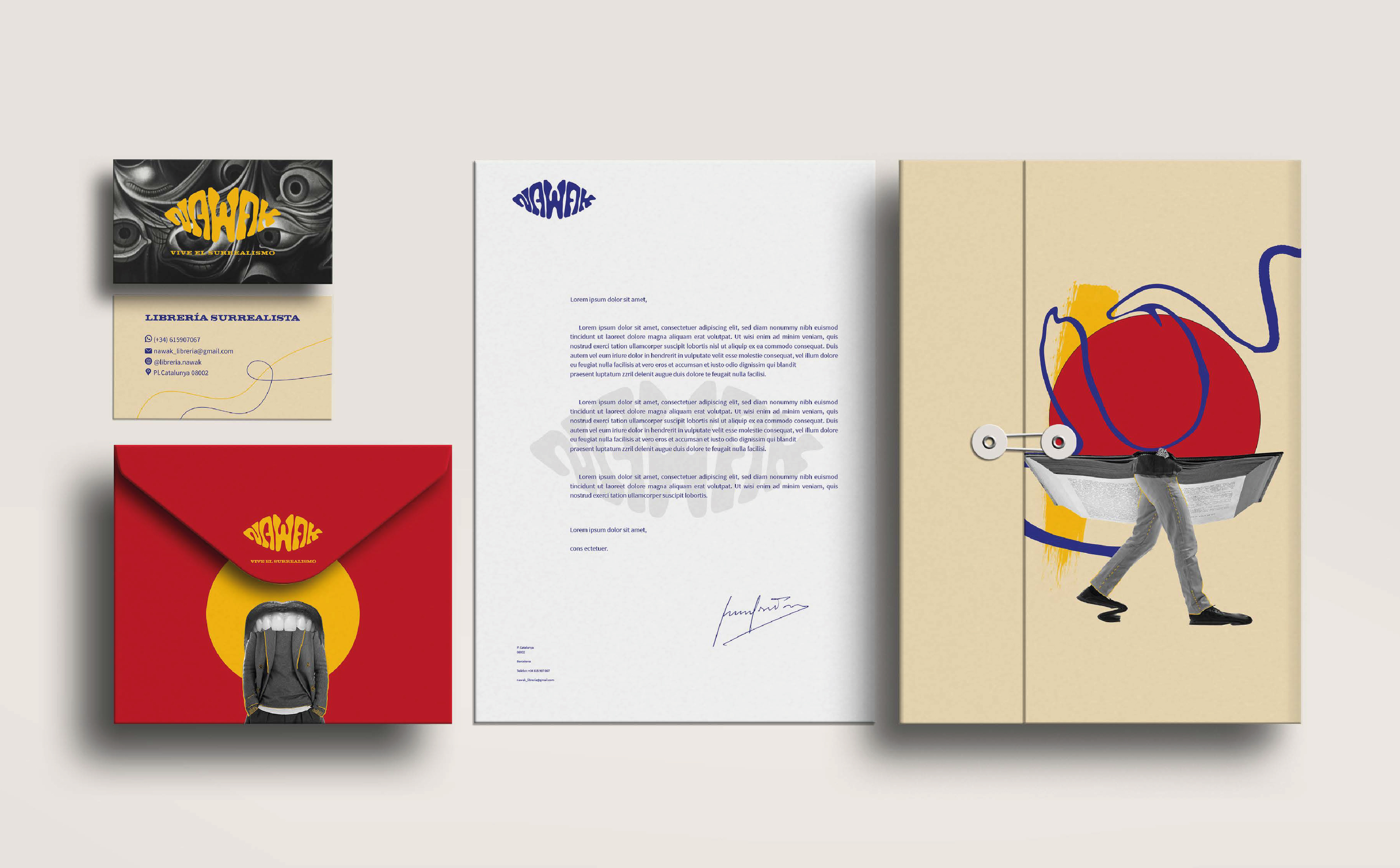
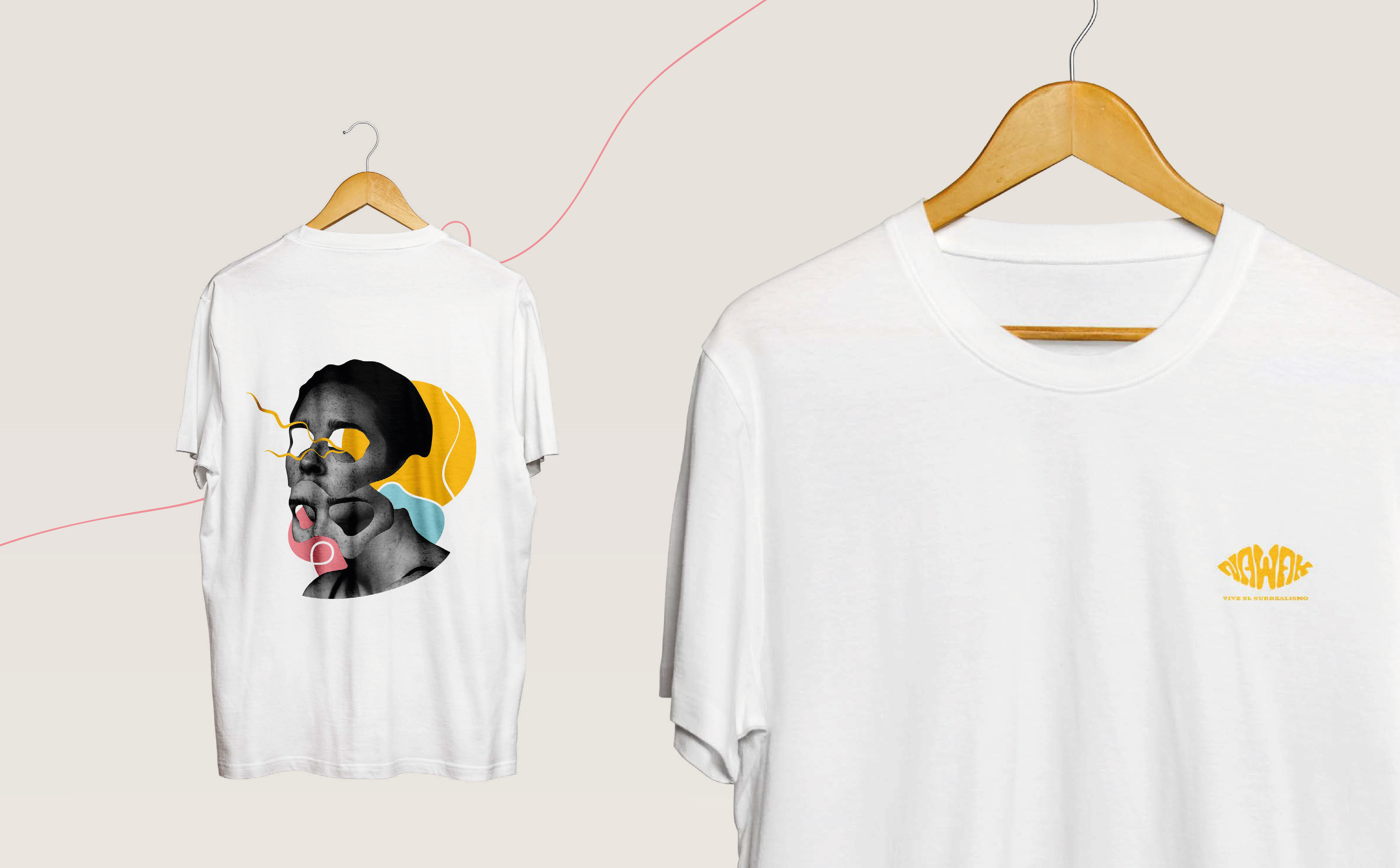
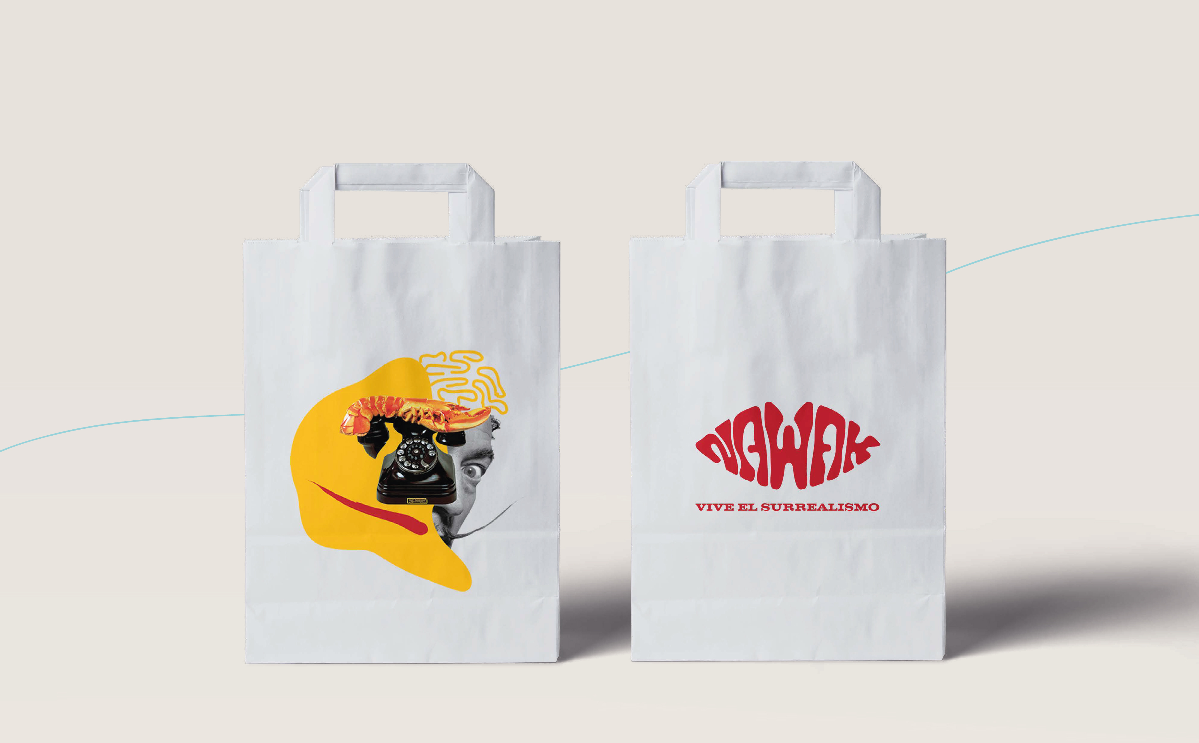
- Logo: Inspired by Dalí’s lip-shaped sofa—bold, sensorial, instantly surreal
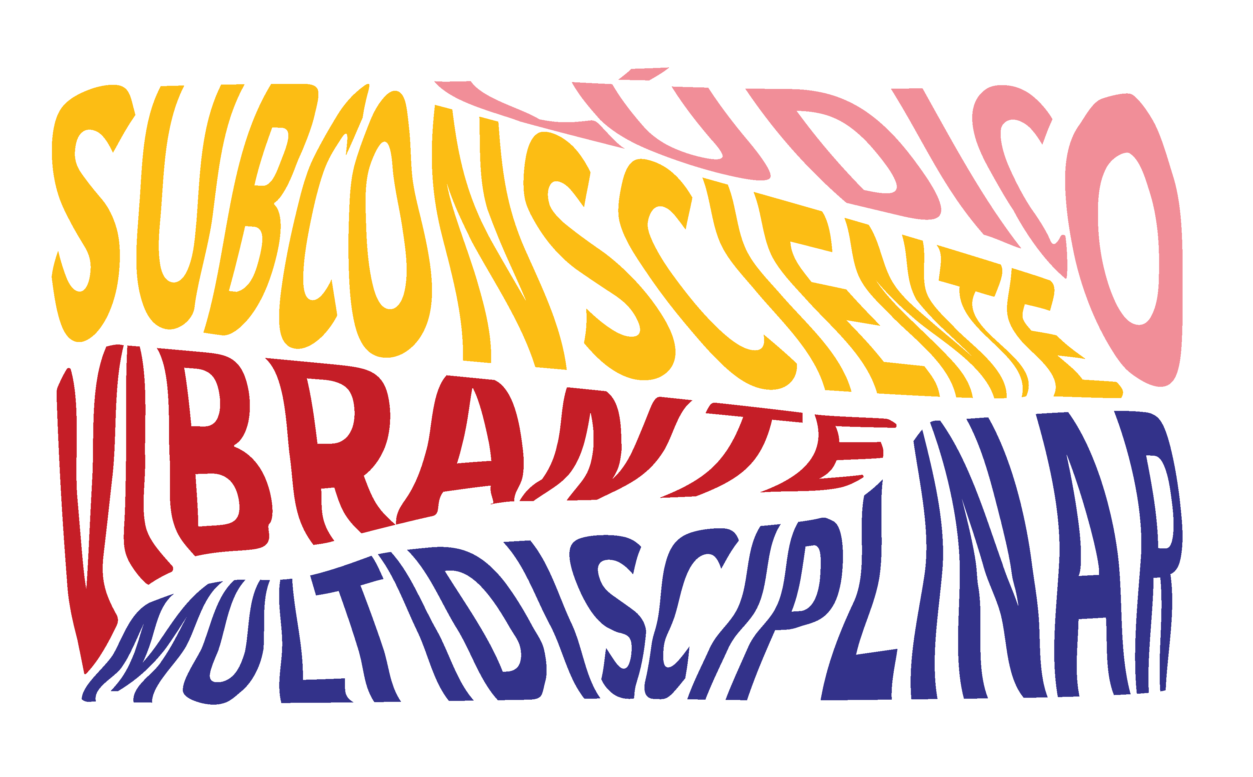
- Typography: Deformed custom letterforms mimicking the unconscious flow of thought
- Color palette: Dominant surrealist pink paired with black and organic accent hues
- Composition: Dreamlike, layered layouts using juxtaposition, collage, and visual rhythm
All assets followed a playful logic of visual dissonance, metaphor, and surprise.
You can explore the full Project Presentation here
Process & Deliverables
🔎 Research & Concept Development
The creation of Nawak began with a deep investigation into surrealism as both an artistic and philosophical movement. Our team immersed itself in the works, writings, and techniques of surrealist pioneers, seeking to understand how creativity could emerge from the subconscious.
We built moodboards, conducted competitive analyses of bookstores and art spaces, and experimented with automatic techniques such as exquisite corpse, cubomania, and automatic writing. These explorations helped shape both the tone and the experiential strategy behind the brand.
🧠 Brand Strategy & Naming
Central to the project was defining a unique brand personality rooted in the surreal. We positioned Nawak as a cultural sanctuary—where literature meets experimentation. The name Nawak, a French colloquialism meaning “nonsense” or “absurdity,” was chosen for its playful energy and reference to surrealism’s French origins. Our brand values—multidisciplinary, extravagant, playful, and subconscious—informed all visual and conceptual decisions moving forward.
🎨 Visual Identity
The visual identity is an homage to surrealist aesthetics: fluid forms, distorted typography, and evocative symbolism. Inspired by Salvador Dalí’s iconic lip-shaped sofa, our logo became a central visual metaphor, blending elegance with eccentricity. A vibrant color palette led by a surreal pink, custom lettering, and organic graphic elements reflected the idea of bending reality and awakening the imagination.
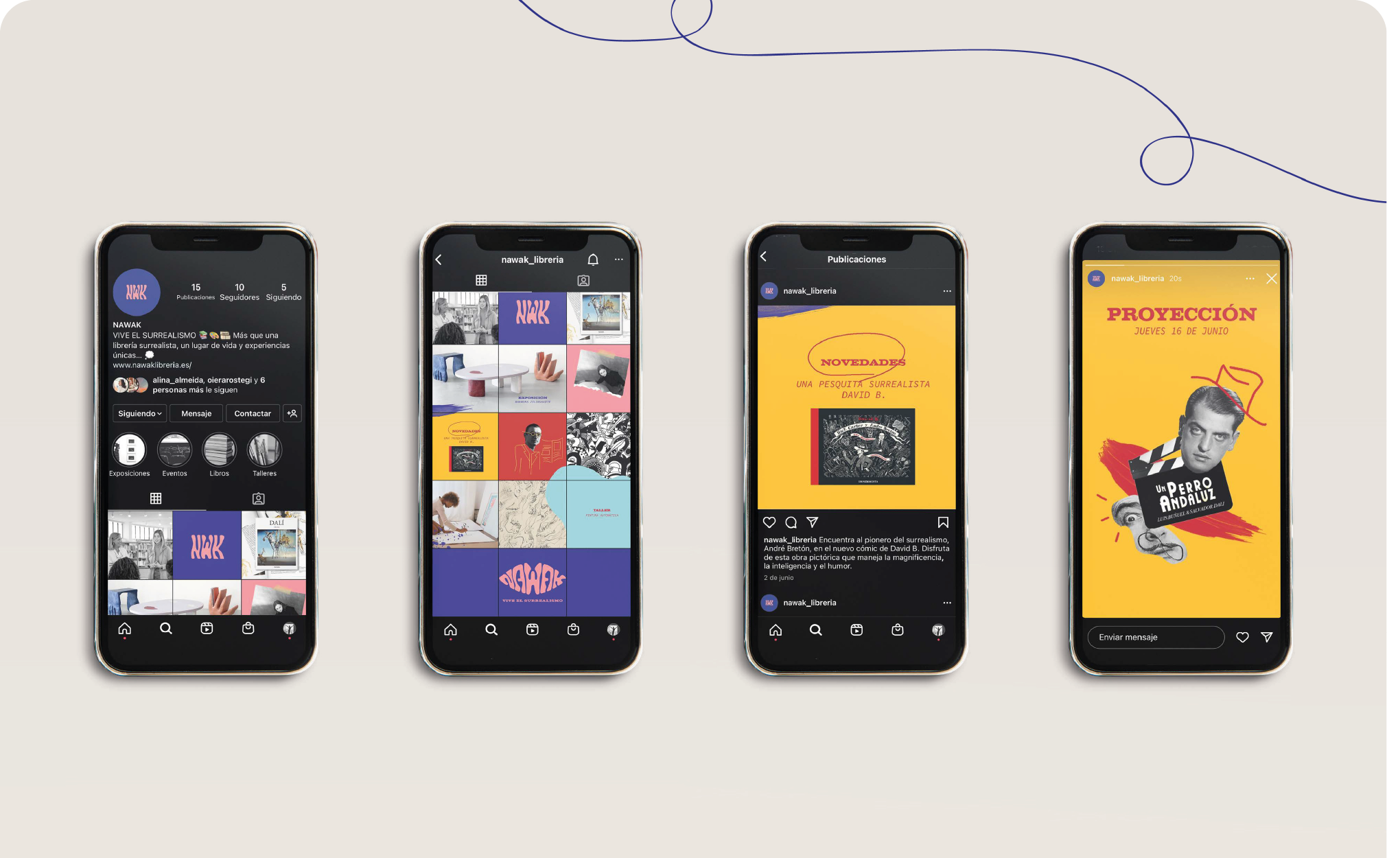
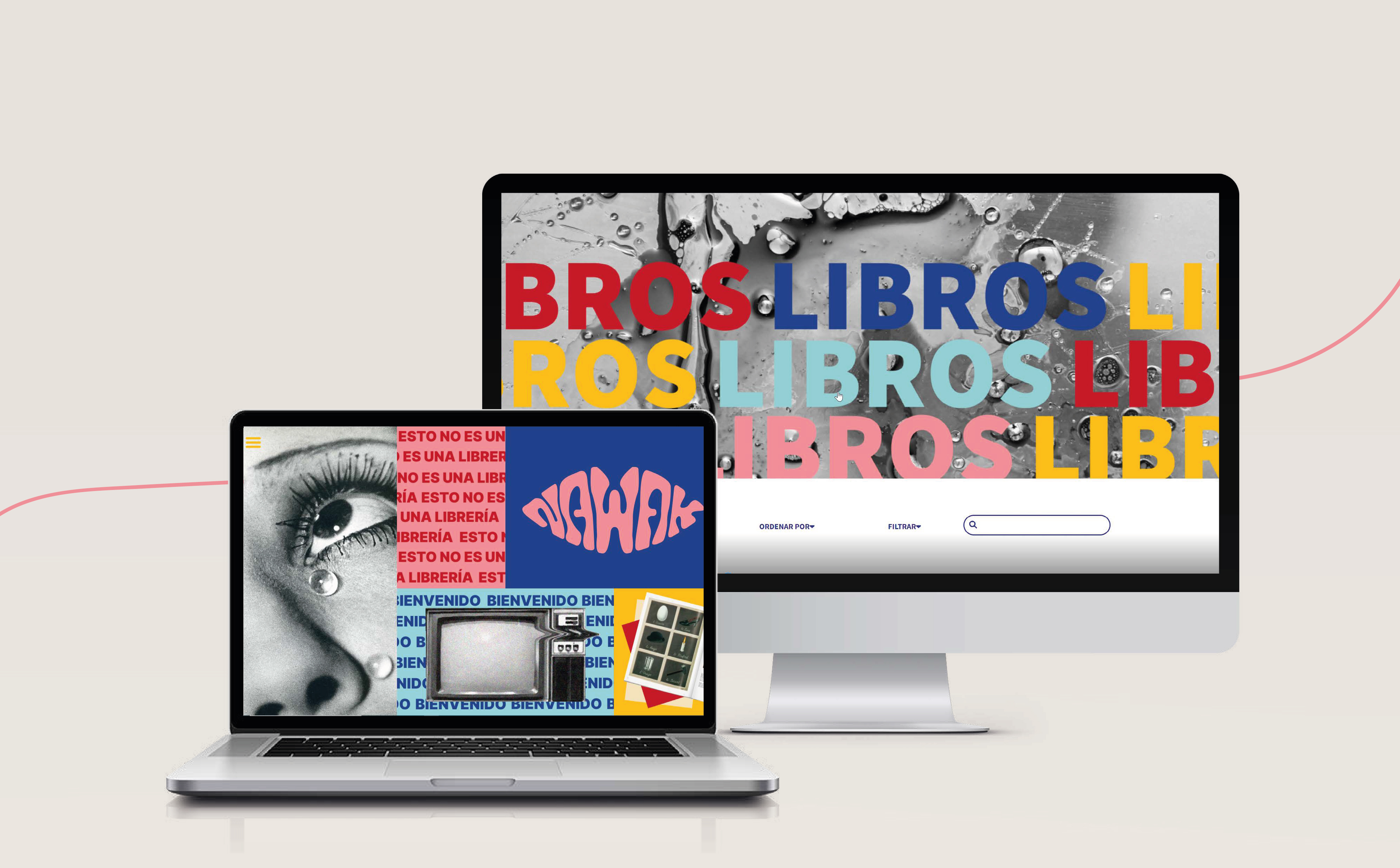
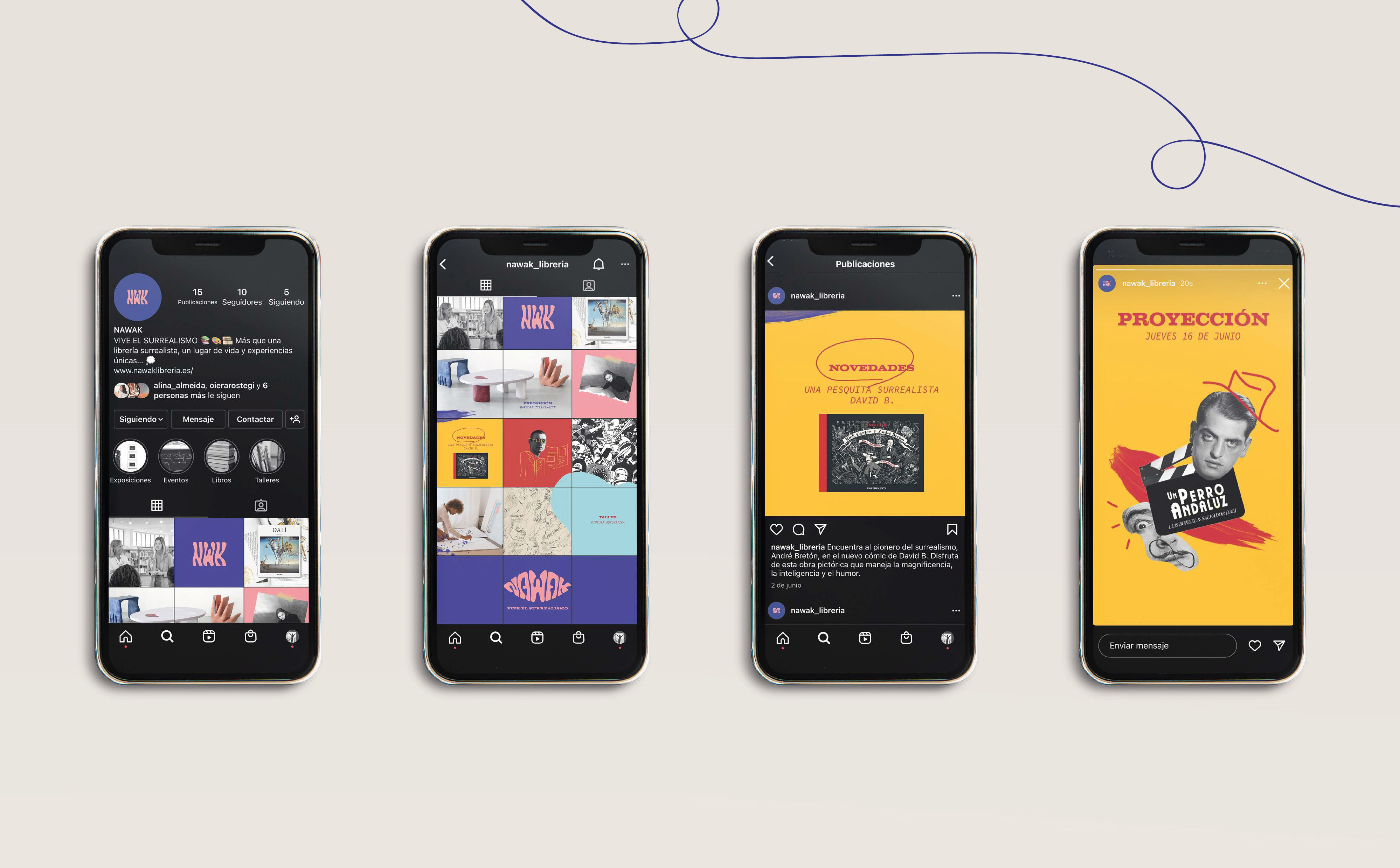
🖥️ Web Design & Development
I led the full design and implementation of the Nawak website. Starting with the UX architecture and wireframes, I translated the brand language into a responsive and immersive digital experience. Built with HTML, CSS, and GSAP animations, the website uses visual metaphors and transitions to invite users into a surrealist journey. While not deployed online, it functions as a fully interactive prototype and was an integral part of the final presentation.
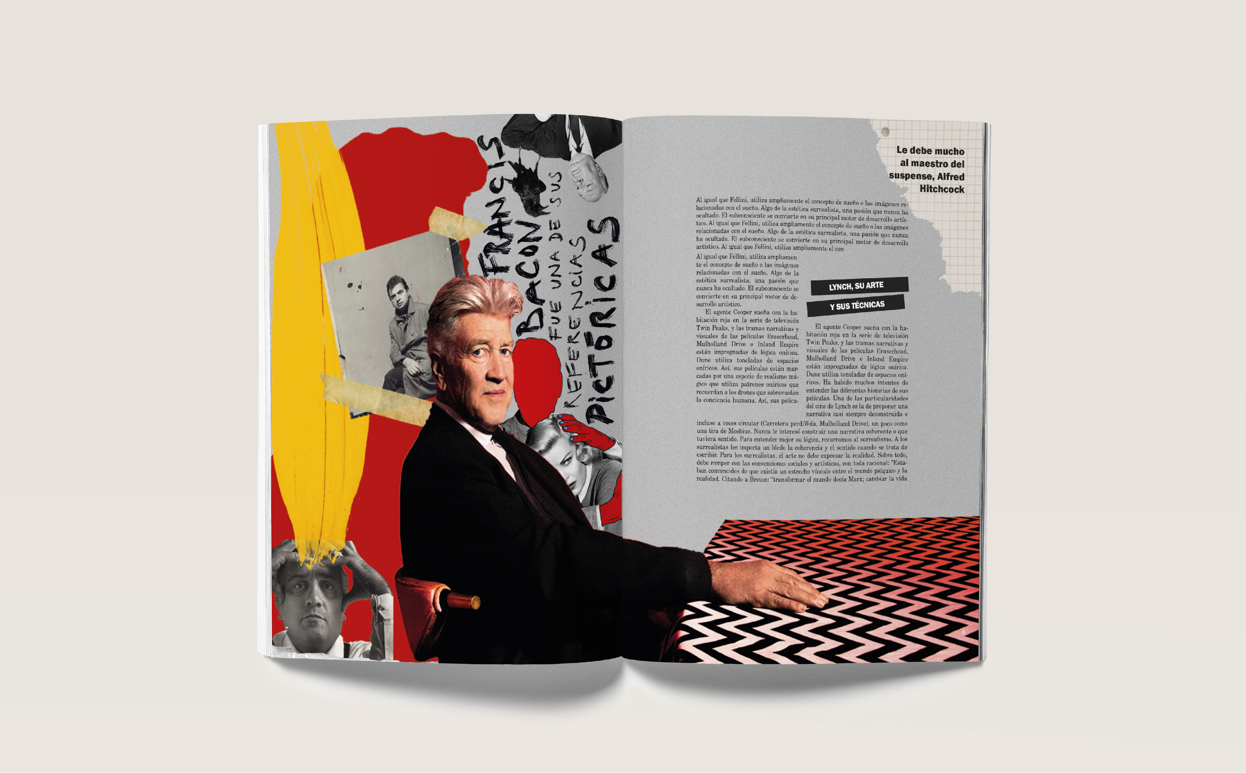
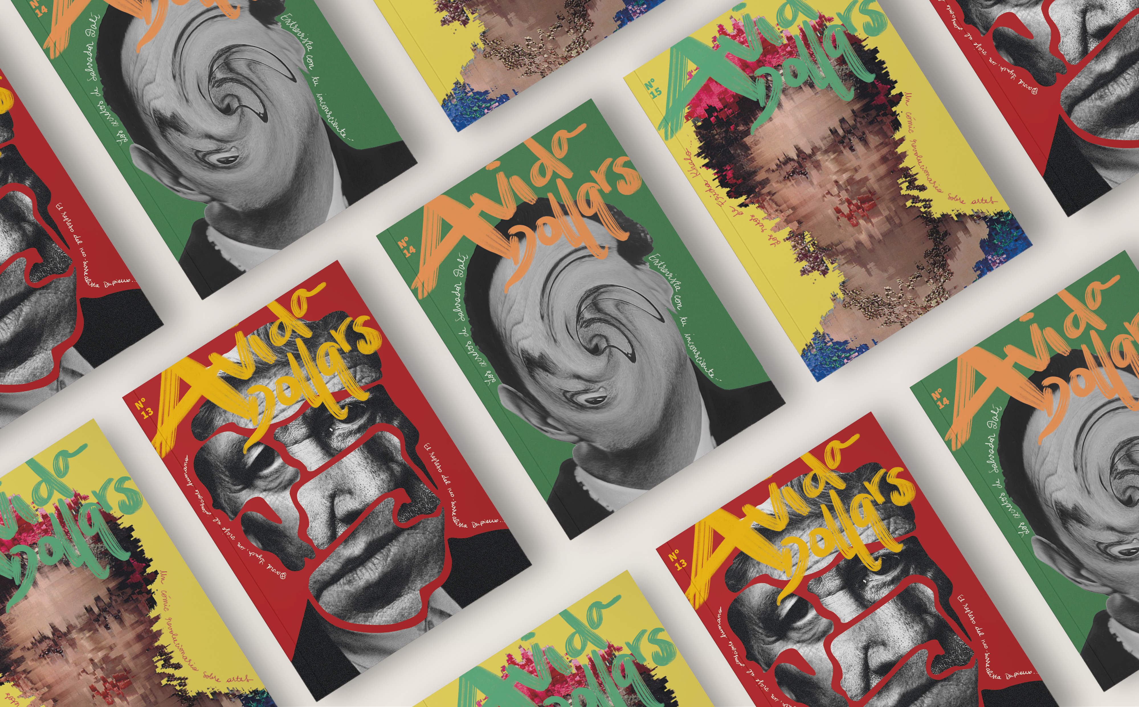
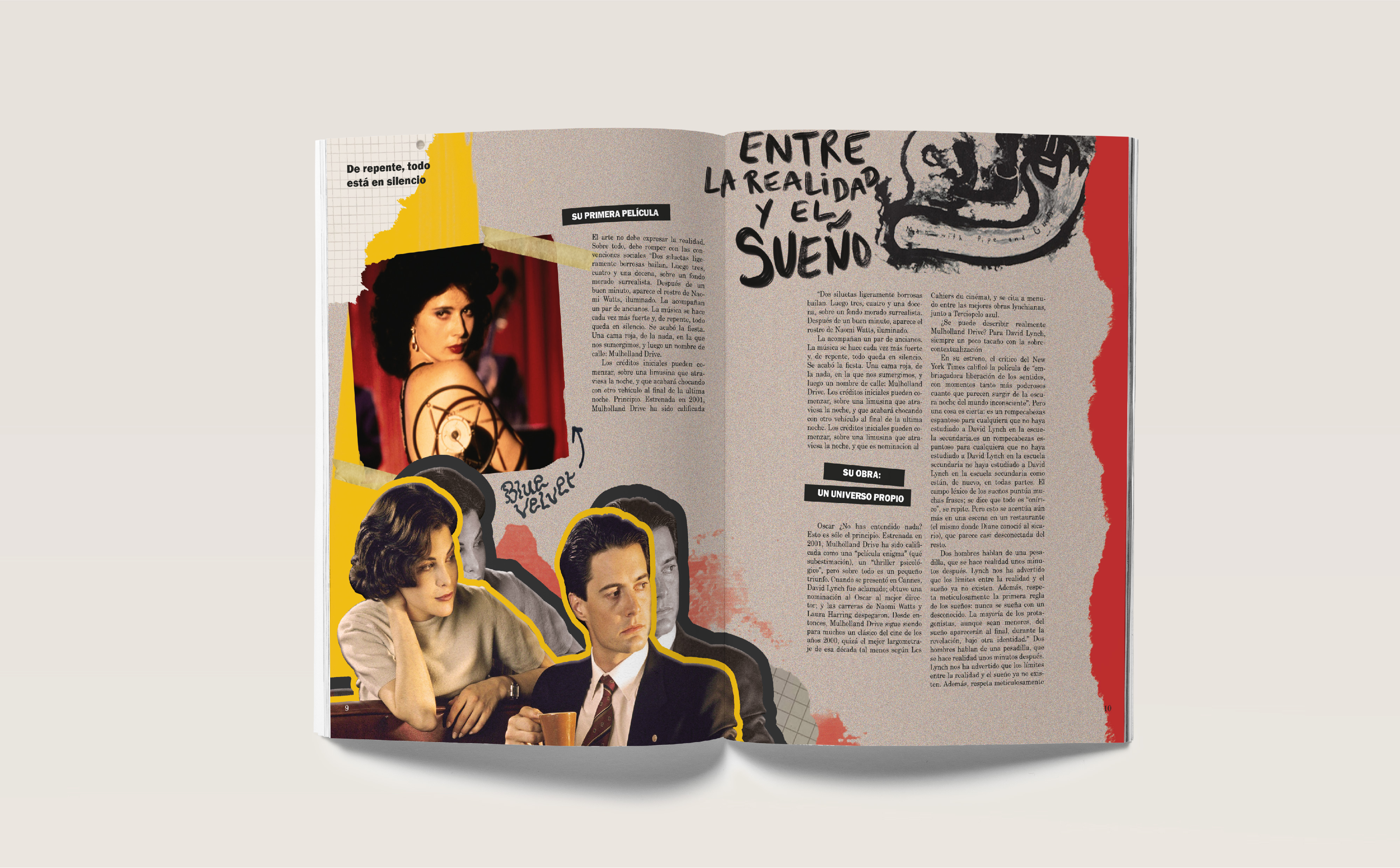
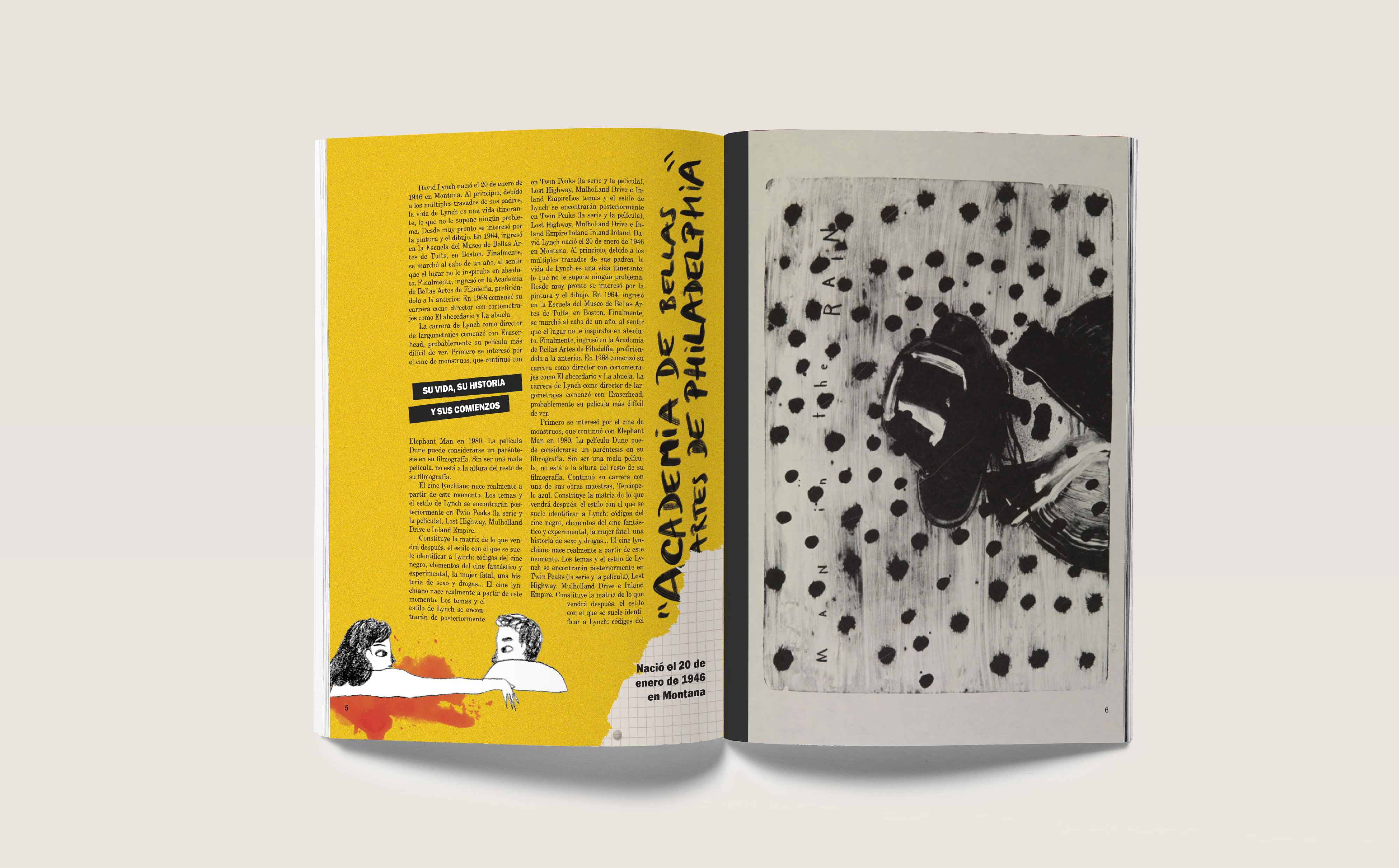
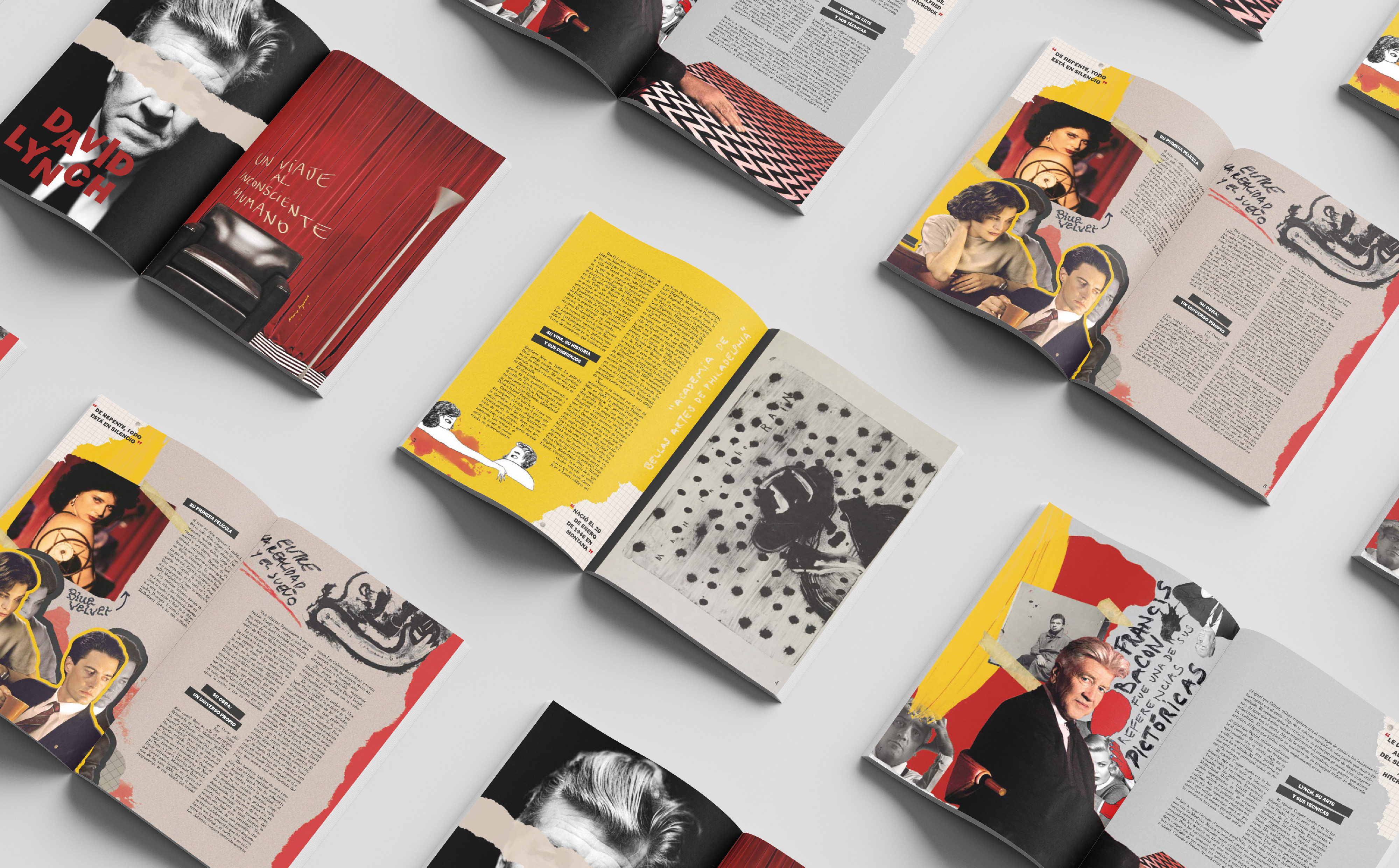
🖋️ Editorial Design — Avida Dollars
As an editorial extension of the brand, we created Avida Dollars, a printed magazine dedicated to surrealist culture. Named after the satirical nickname André Breton gave to Dalí, the magazine explores themes around exhibitions, poetry, cinema, and surrealist techniques. Designed and printed with attention to layout, type, and materiality, it served as both a showcase of the brand's narrative and a tactile user experience.
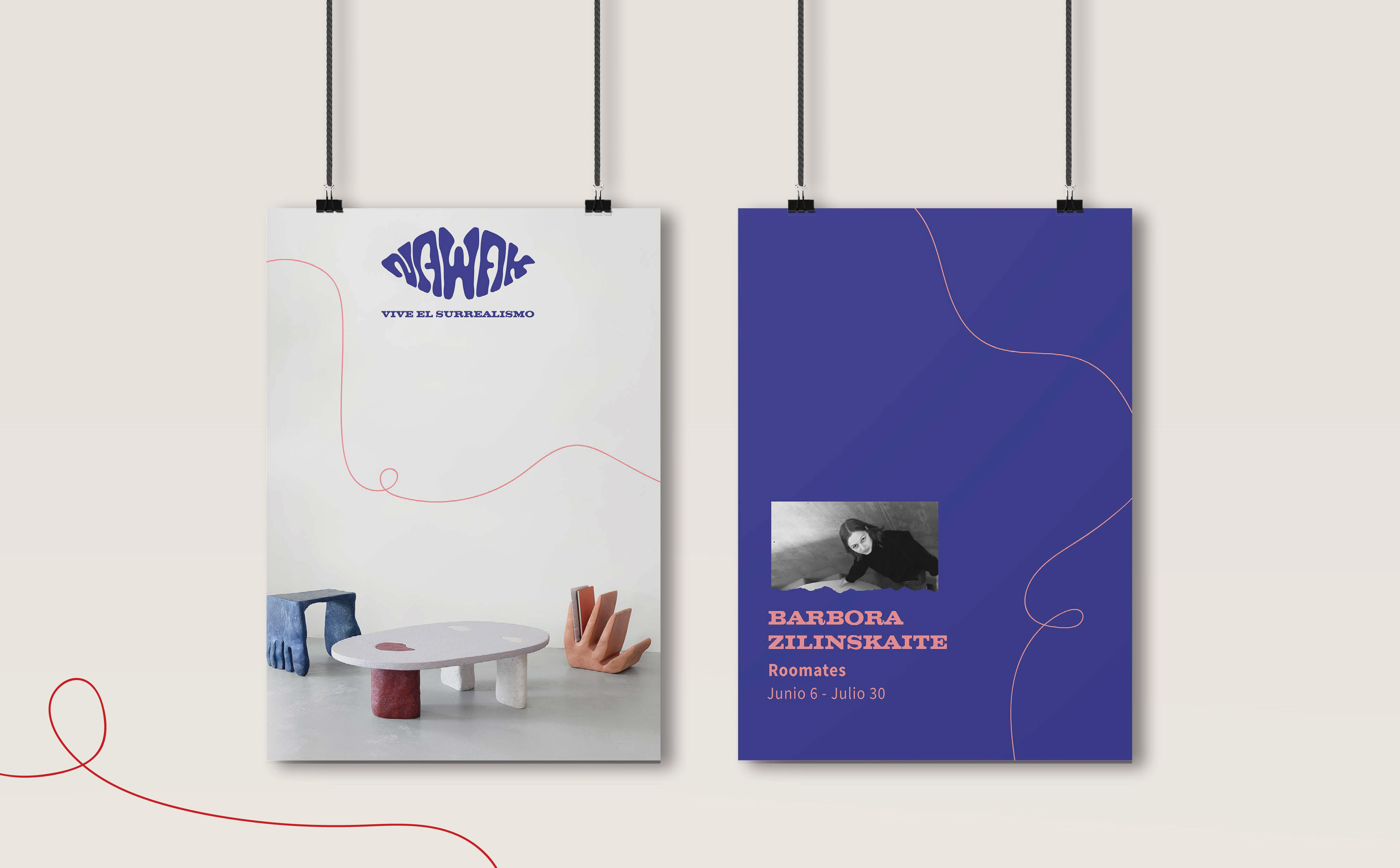
🏛️ Spatial & Merchandising Concepts
Nawak was also imagined as a physical experience. We proposed immersive room designs, event zones, and sensory corners to bring surrealism into the visitor's environment. Merchandising included conceptual posters, bookmarks, tote bags, and artist-designed items that could be sold or given away in-store, acting as small portals into the surreal world of Nawak.
Results & Outcomes
Nawak was received as one of the most original and complete Master’s projects. Our proposal was praised for its conceptual depth, multidisciplinary range, and strong visual storytelling. It also stood out for its emotional dimension—offering not just a brand but a gateway to introspection and creative expression.
What I learned from this project
-
How to lead and collaborate across multiple design disciplines
-
Balancing experimentation with coherence in large-scale branding
-
Communicating abstract ideas through concrete design systems
-
Working with imposed teams and adapting to different creative languages
-
How to code and prototype a design vision from scratch