Talentup Salary
Platform
A centralized tool for smarter compensation analysis and workforce insights.
Project Overview
TalentUp is a SaaS platform that helps HR teams benchmark salaries, manage employee compensation, and understand market trends across roles, industries, and countries.
As the sole Product Designer, I led the complete visual and content redesign of TalentUp’s salary benchmarking platform, working closely with the product team to transform a feature-heavy but underutilized tool into a more strategic, user-focused experience.
Timeline
6 months
Role
Product Designer
Platform
Responsive Web Application
Team
1 Product Designer (me)
1 Product Owner
1 Backend Developer
1 Frontend Developer
Tools
Figma
FigJam
Status
In development
Contribution
- Information architecture overhaul
- Visual design system
- Content and UX writing
- Component design
- High-fidelity UI
- Developer handoff
Problem Context
TalentUp had valuable functionality, but poor usability was holding it back. Users—primarily HR professionals—found the interface confusing and the language too technical. Many used their credit allowance for one-off salary searches but rarely engaged beyond that.
Key features like employee management or the dashboard were largely ignored, either due to lack of clarity or perceived irrelevance. The platform lacked consistency in design, and feedback showed that users were unsure how to extract insights or take meaningful action.
80%
Users dropped off after a single search, with no further interaction within the app.
22%
Reported that key terms and features were confusing or not self-explanatory.
84%
Of active users had never added employees to the platform, a core part of the product’s intended value.
Core Challenge
How might we improve retention by turning TalentUp into a daily-use platform for HR professionals, not just a one-time benchmarking tool?
Final Solution
We redesigned the platform for better usability, making data more accessible and valuable for HR teams.
Add a new employee
Spend one credit
Solution hightlights
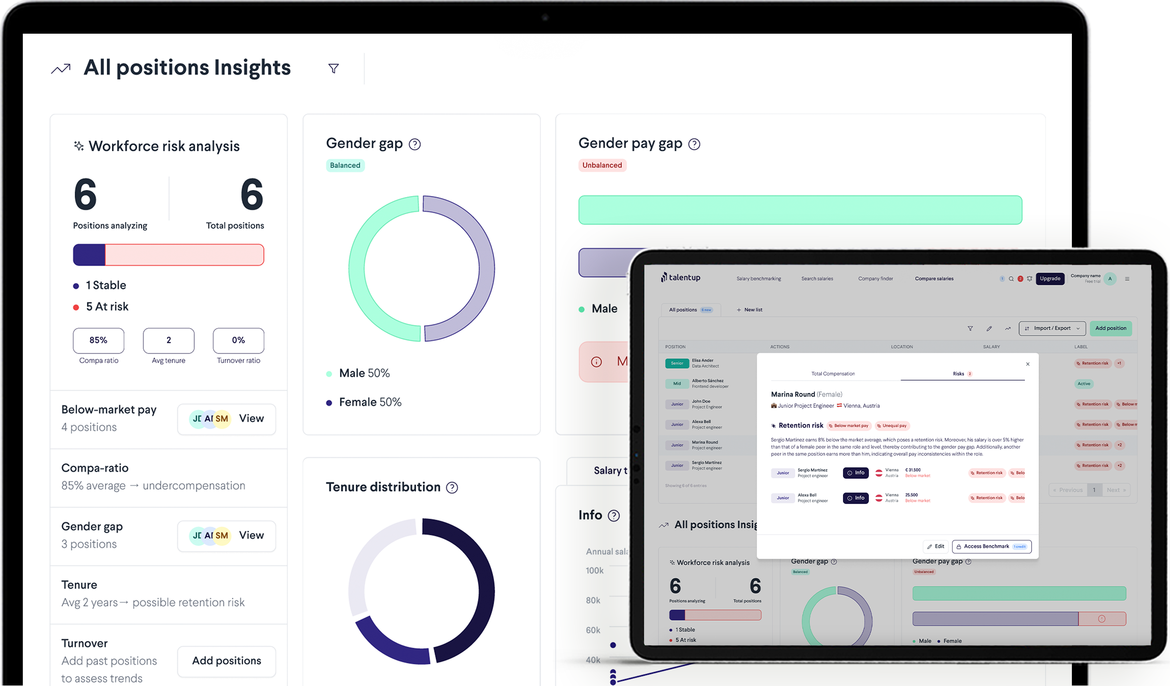
Control Dashboard
Compare Salaries
Research and prototiping
Context
To better understand the current state of the platform and the HR professionals using it, we began by conducting a competitive benchmark. We analyzed direct competitors like Ravio, Figures, Pave, Compensation IQ and Gradar, identifying common patterns, value propositions, and usability trends.

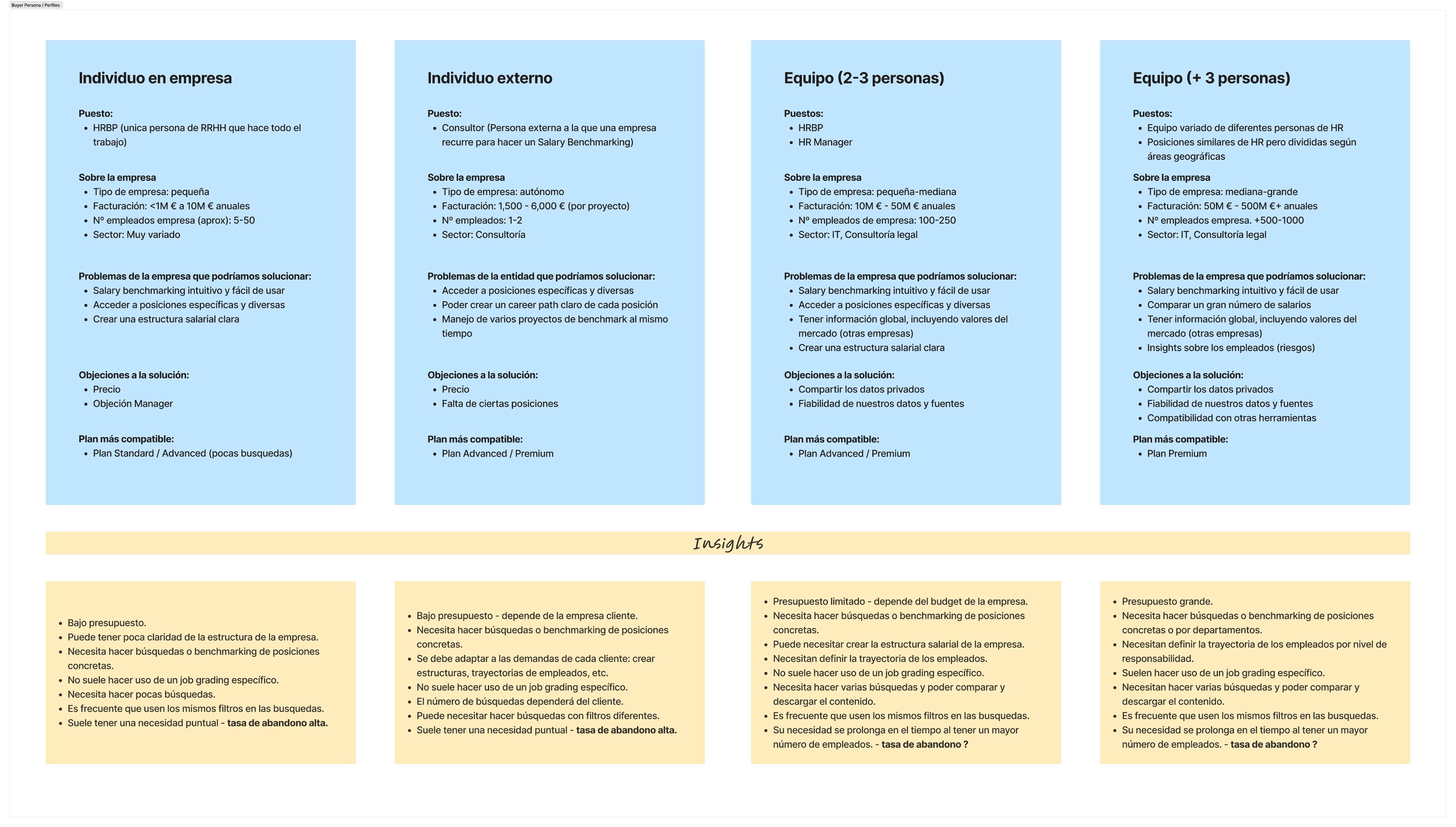
We also evaluated TalentUp’s existing buyer personas, ranging from solo HR professionals to large teams, mapping key user needs and behaviors to uncover pain points in the current experience.
Key Insights
From the research, we identified four main opportunity areas:
🔗
Lack of integration with HR systems
Users expect to connect platforms like BambooHR, Oracle, Personio, HiBob, or SAP to automatically import employee data. Without integration, the manual upload process becomes a barrier, especially for larger teams.
📉
Underused core features
Users need the ability to compare, filter, and download data, especially within salary benchmarking. However, the current experience is fragmented, with key features spread across sections, leading to low engagement.
🔐
Lack of trust and transparency
Competitors emphasize confidentiality, anonymization, and legal compliance, while TalentUp lacks messaging around data safety, source transparency, or methodology, all of which are critical to trust-building.
🧭
Misaligned value proposition
Users often rely on Search Salaries, but the platform barely highlights this on its website. The current label "Manage Employees" creates friction, giving the impression users must input sensitive employee data.
Strategic Design Solutions
Based on these insights, we redefined the platform’s information architecture and core functionality, creating a new feature structure:
📊
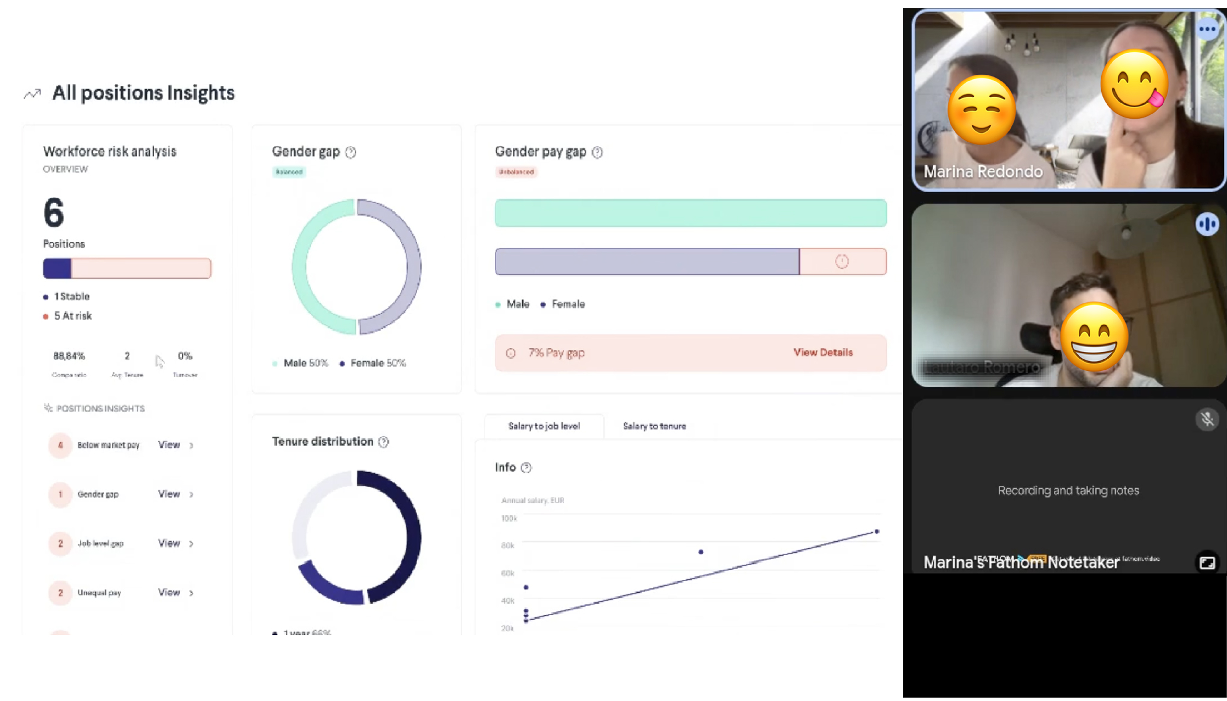
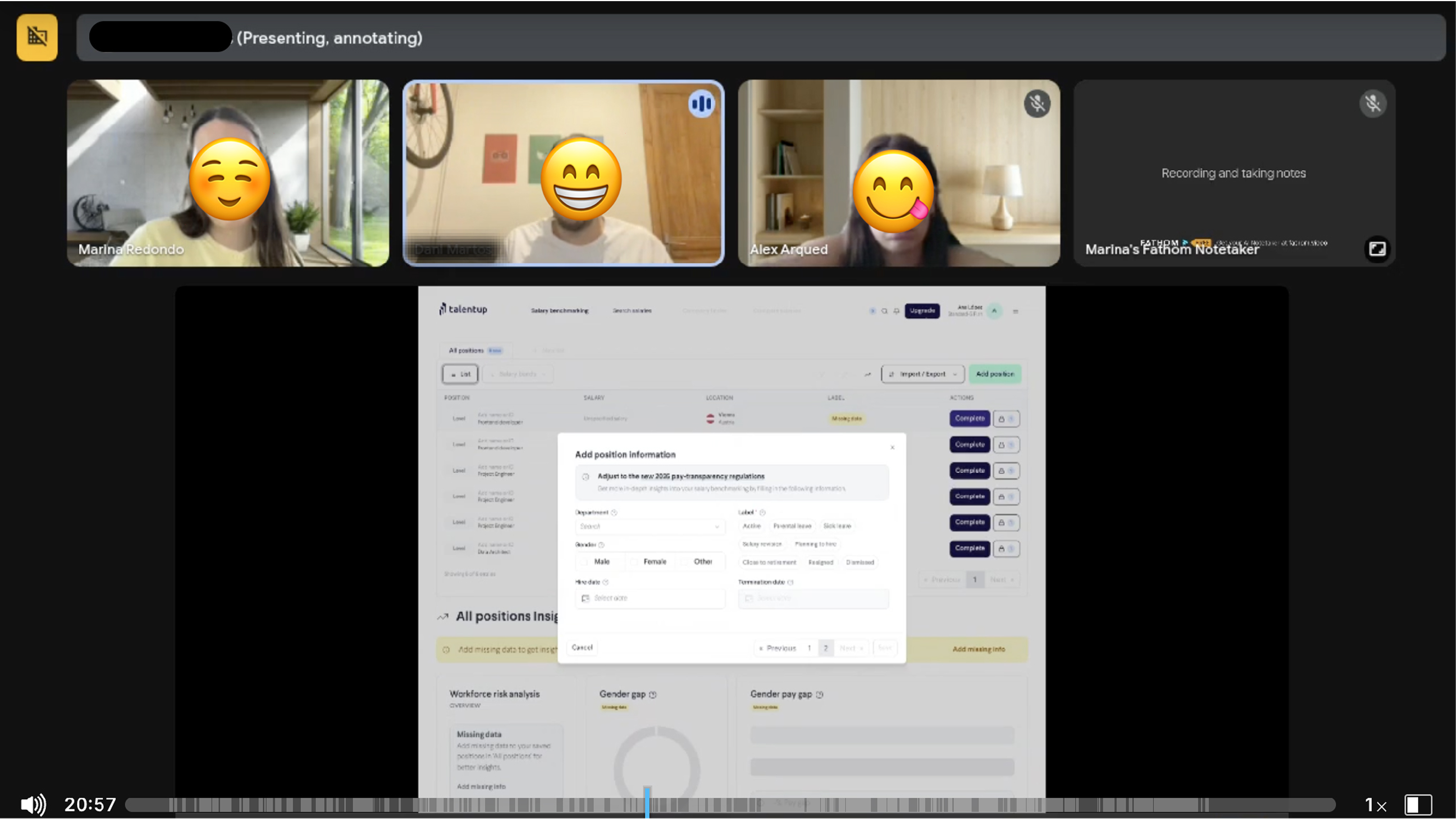
Salary Benchmarking
- Editable tables
- Smart lists
- Downloadable insights
- Data visualizations (e.g. equity pay, retirement risk, gender ratio).
🔎
Search Salaries
- Advanced filtering
- Market Trends
- Similar Roles
- Bonus / Stock Breakdowns
🏢
Company Finder
- Salary Tables
- Hiring Trends
- Company Overviews by Department
⚖️
Compare Salaries
- Compare up to 10 positions across locations and contexts
- Location-specific insights (e.g. Cost of Living, Inflation %, Unenployment &)
We also introduced renaming strategies, such as changing Manage Employees to Salary Benchmarking, to match user expectations and reduce perceived risk.
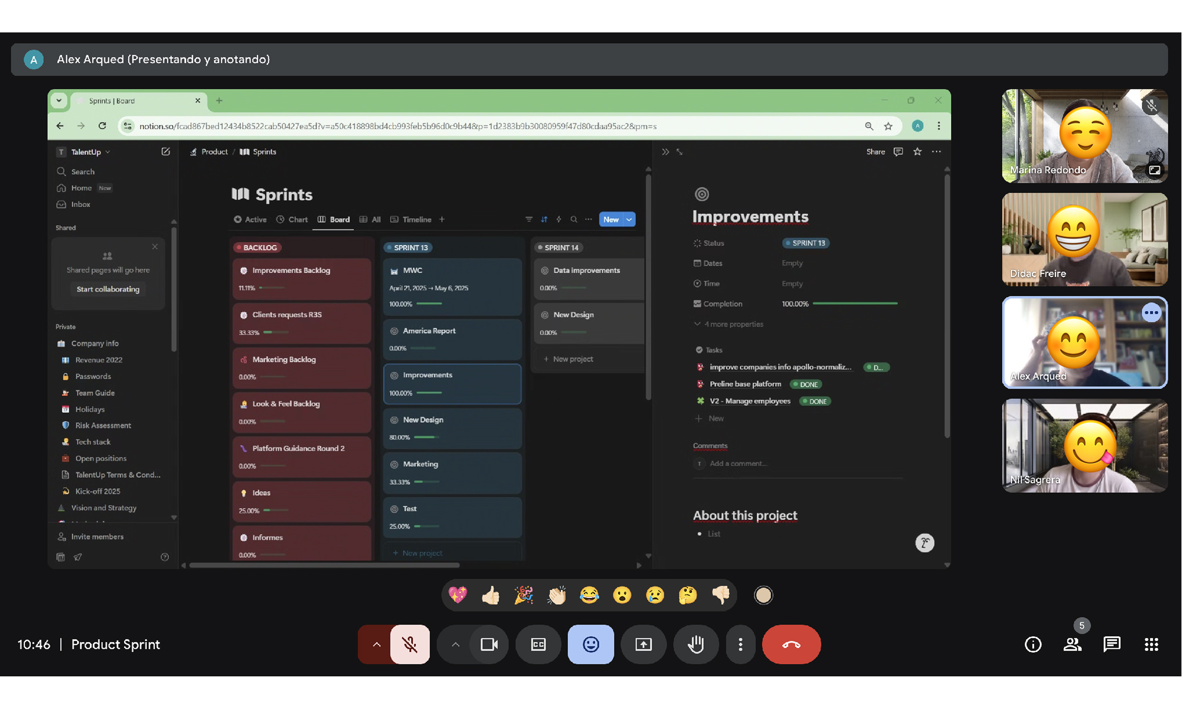
Prototyping
We sketched low-fidelity wireframes by hand to quickly iterate on structure and layout. These helped us visualize how features like smart lists and benchmarking flows could interconnect across the platform.
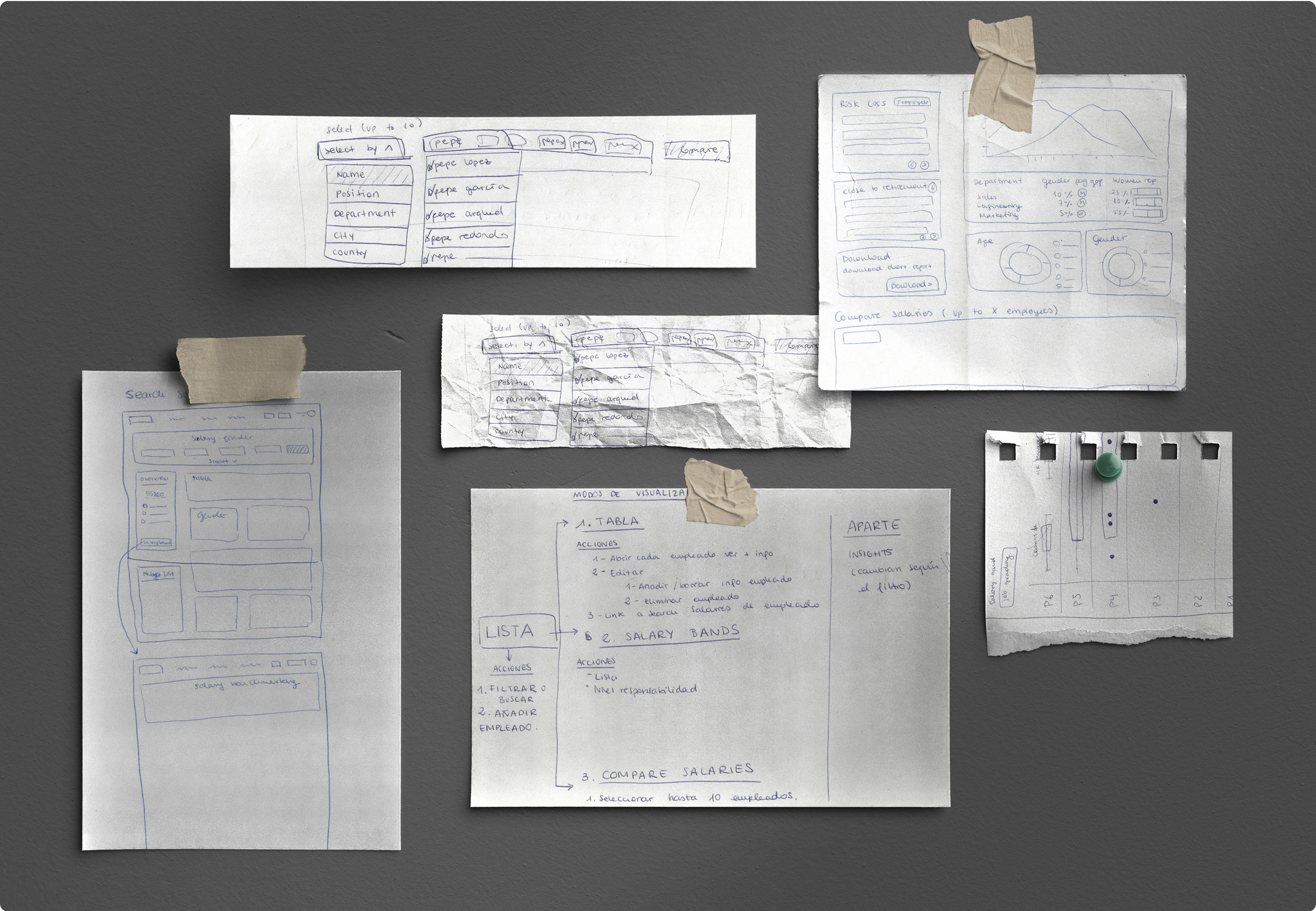
After defining flows, we moved to digital wireframes and developed a design system from scratch using Preline (Tailwind CSS) as a base. Over 200 components were created and documented in our shared design library,something the platform had never had before.
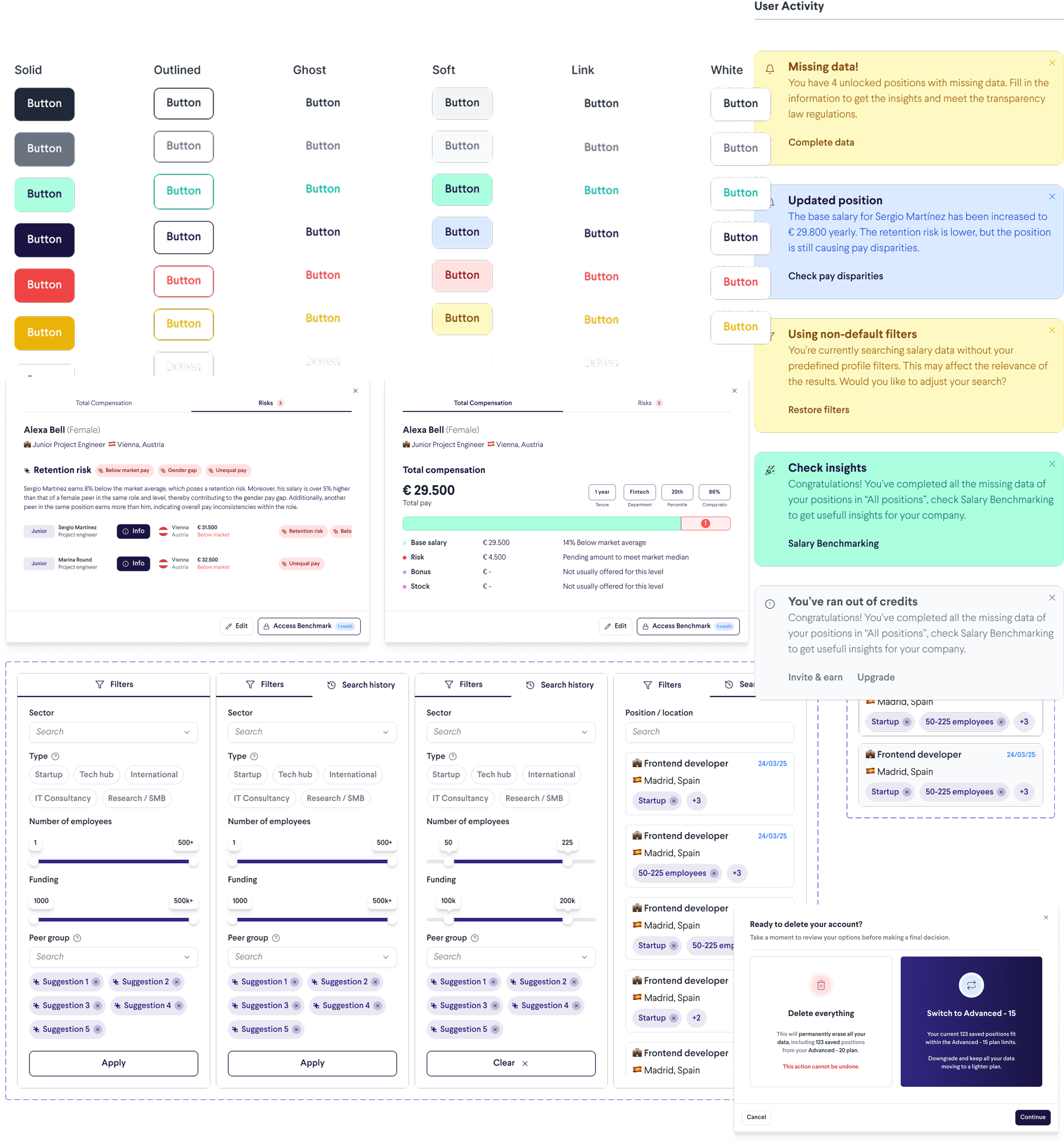
We worked in close collaboration with both frontend and backend developers throughout the process, ensuring that all designs were technically feasible and that the necessary data was available to deliver trustworthy insights.
Usability Testing
As part of the redesign of TalentUp, a salary benchmarking platform for HR professionals, we conducted a series of remote usability tests to validate new functionalities and ensure the overall user experience was clear, intuitive, and aligned with users’ mental models.
We created two distinct user test flows to reflect different onboarding scenarios:
- Case 1: The user registers and their company is found in the database, so employee positions are automatically loaded.
- Case 2: The company is not found, and the user must manually add employees to start benchmarking.
We interviewed seven professionals across HR roles: Compensation & Benefits specialists from large teams, generalist HR/People Ops professionals from scaling startups, and external consultants managing multiple clients. Some had prior experience with TalentUp, while others were first-time users, giving us valuable contrast in expectations and comprehension.
Each session lasted 20–30 minutes and was conducted remotely. Users followed a task-based script covering key actions such as registering, adding employee positions, exploring insights, unlocking market benchmarks, and comparing internal data with market trends. All inputs were auto-generated to reduce cognitive friction and focus on usability.
Feedback and last changes
Our main objectives were to validate the logic of the new flows (especially the link between internal salary benchmarking and market data), observe potential friction points, and assess whether key concepts like credit usage, benchmarking access, and insight interpretation were clearly understood.
The interviews revealed key improvement areas: insight visualizations needed clearer structure, users wanted to adjust percentile comparisons by department, and some labels and copy were confusing. Based on these findings, we iterated on flow structure, rewrote key UI text, and made targeted design changes in Figma to ensure better alignment with user expectations.
The result was a refined and more user-centered prototype, improving clarity, trust, and efficiency in salary analysis for HR professionals.
Project Status
After completing the final design iterations based on user testing insights, we updated the necessary components in Figma and closed the design phase. The project has now entered the development stage. We are currently working closely with the engineering team through recurring meetings to review implementation progress, identify and resolve design inconsistencies, and continuously test key flows as they are developed. This collaborative phase ensures that the final product remains faithful to the design intent while being technically feasible and user-friendly.
Conclusions
The redesign of TalentUp’s platform aimed to realign the product’s core value with user expectations—placing a stronger focus on salary benchmarking, data transparency, and actionable insights for HR professionals.
Through early-stage research, collaborative work with developers, and multiple prototyping and testing cycles, we delivered a more focused, trustworthy, and user-friendly product experience.
Key outcomes:
- Enhanced understanding and perceived value of the Salary Benchmarking feature through clearer structure and functionality.
- Increased user trust, supported by stronger messaging around data privacy, source transparency, and methodology.
- A scalable, consistent UI built on a reusable component system, improving design cohesion and development efficiency.
- Streamlined workflows tailored to the needs of both occasional users and compensation specialists, reducing friction across the platform.
What I learned from this project
-
User research is most valuable when it leads to design decisions
Testing real flows with actual HR professionals helped us spot specific usability issues and restructure the product in ways that truly improved the experience.
-
Copy isn’t cosmetic — it’s functional
Strategic changes in naming and terminology (e.g. “Salary Benchmarking” vs. “Manage Employees”) had a direct impact on comprehension and user trust.
-
Prototypes don’t need to be perfect — they need to be real
Using realistic, auto-generated data helped us run focused tests and get meaningful feedback without overwhelming participants.
-
Design systems are not just about components — they enable alignment
Creating a consistent, documented component library helped us collaborate efficiently with developers and ensured visual and functional coherence.
-
Product quality improves when design stays involved in development
Being present during development, reviewing weekly builds, and adjusting flows in context allowed us to catch critical issues early and ensure that what was built matched the design intent.