Case Study
TalentUp
Web Page
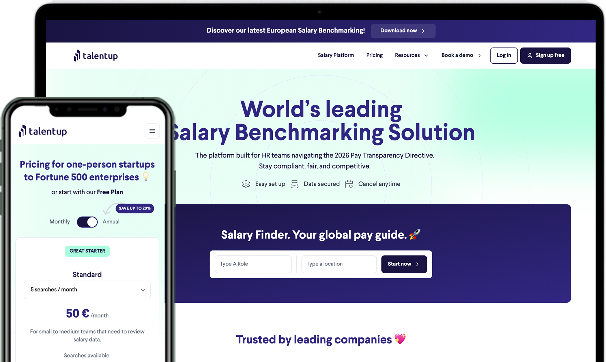
A full rebrand and digital overhaul to align identity and global SaaS growth.
TL;DR
TalentUp had outgrown its startup branding. As sole designer and brand lead, I rebuilt everything from scratch — new logo, full visual identity, component system in Figma, and ~80% of the frontend — resulting in a +60% traffic increase in the first 3 months.
01 — Problem
A product that had grown — but a brand that hadn't
TalentUp had evolved into a robust compensation intelligence platform, but the company's image still reflected its startup origins. The visual identity lacked structure, polish, and strategic intent. The existing website was outdated, difficult to maintain, and failed to communicate value to potential clients.
Logo & Brand issues
- Lacked visual balance and scalability
- No established minimum size or usage rules
- Did not reflect innovation or professionalism
Website issues
- Messy, overlapping code with no reusable system
- No clear visual or content hierarchy
- Low conversion and unclear messaging
- Misaligned with product design and positioning
02 — Final Solution
A clearer, more professional expression of the product
The brand and site were transformed from a scrappy startup identity into a confident, international SaaS presence. Every touchpoint — logo, palette, type, web pages, and copy — now tells the same story.
TalentUp.io — live website overview after rebrand and redesign
Methodology page — communicating data trust and source transparency
Download Report page — salary reports available to export
Salary Platform page — core benchmarking flow
03 — Brand Strategy
An identity built for global markets
The goal was to create a brand that felt ready for international expansion while remaining human and accessible. We redefined all brand elements: logo, color palette, typography, supporting graphics, and iconography — documented in a full BrandBook with usage guidelines.
Global
Ready for international markets
Fresh
Visually modern and relevant
Expertise
Professional and data-driven
Reliable
Consistent and clear in tone
Open
Human and transparent
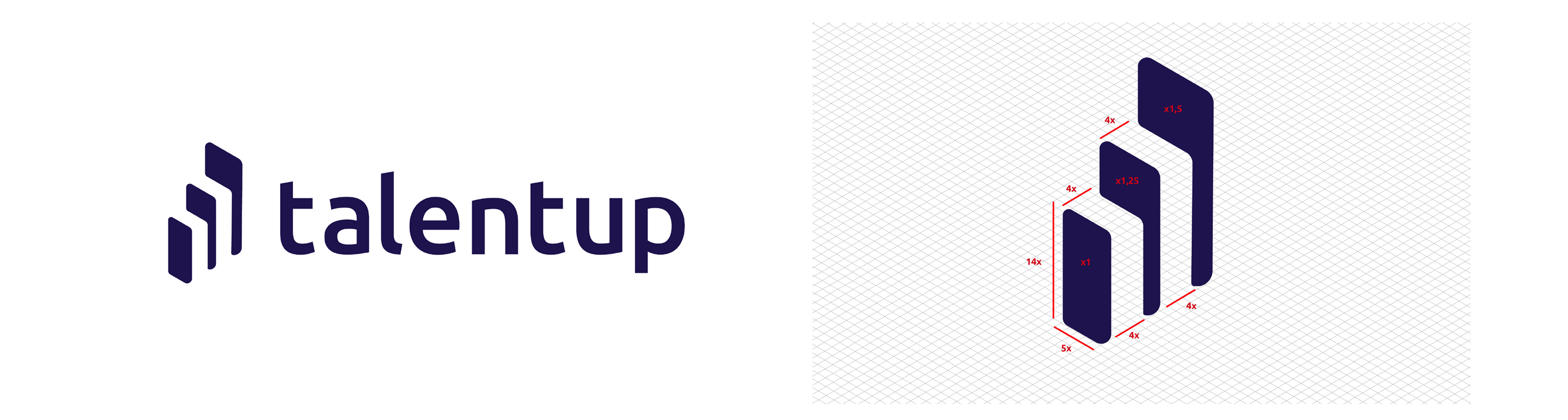
New logo — balanced proportions, clear construction grid, symbolic flexibility
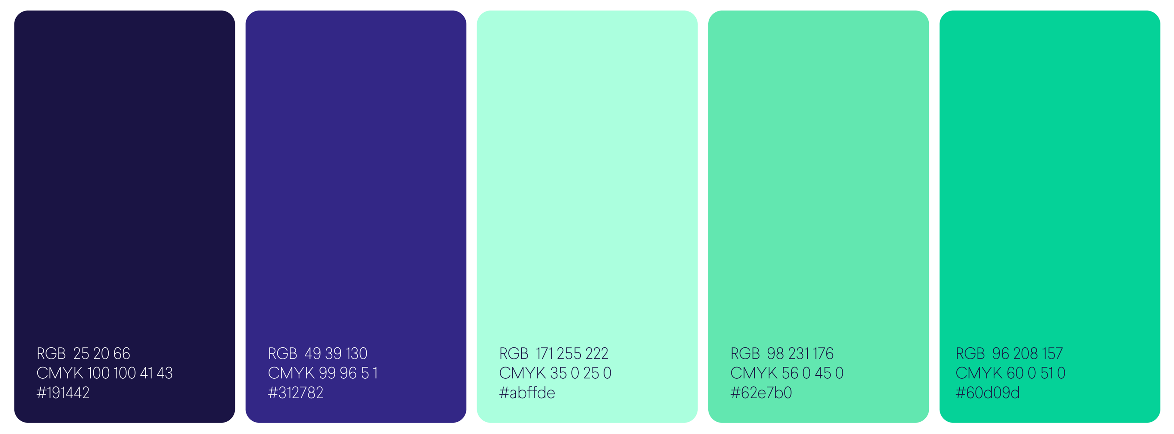
Color palette — modern, vibrant, and accessible across digital and print
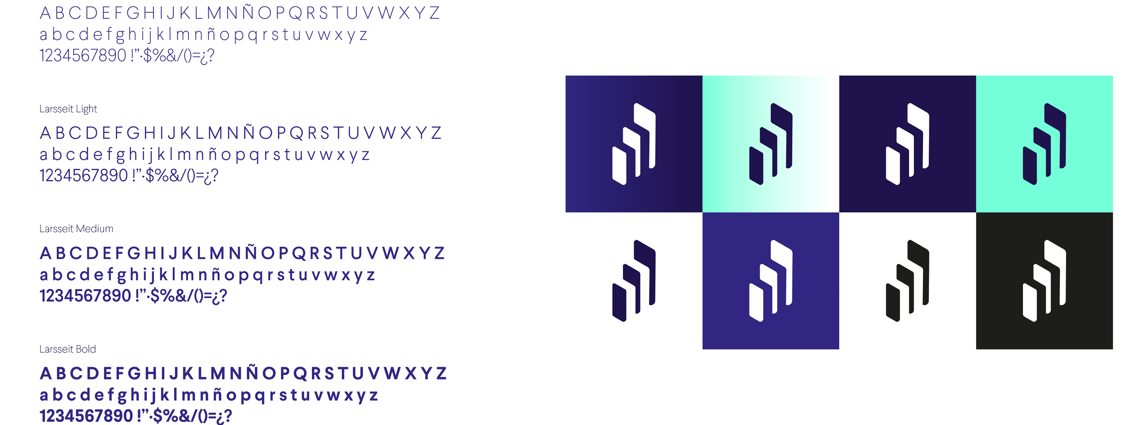
Typography system — refined for web and print consistency
Full BrandBook with usage guidelines
Access04 — Web & UX
Architecture first, then design
We started by mapping a new Information Architecture in Miro — aligning pages and flows with the new brand strategy and SEO objectives. Then in Figma, I built a full design system from scratch: buttons, cards, headers, banners, and forms — all adapted from Preline (Tailwind) and documented for developer handoff.
Faster iteration
A reusable component system cut design time and made exploring layouts much faster without starting from scratch.
Visual consistency
Every page shared the same visual language — typography, spacing, and color applied systematically across the site.
Developer-friendly handoff
Documented components and design tokens gave the frontend team everything they needed, minimal back-and-forth.
SEO & scalability
Layouts built with content marketing in mind — semantic structure, clear CTAs, and room to grow with the product.
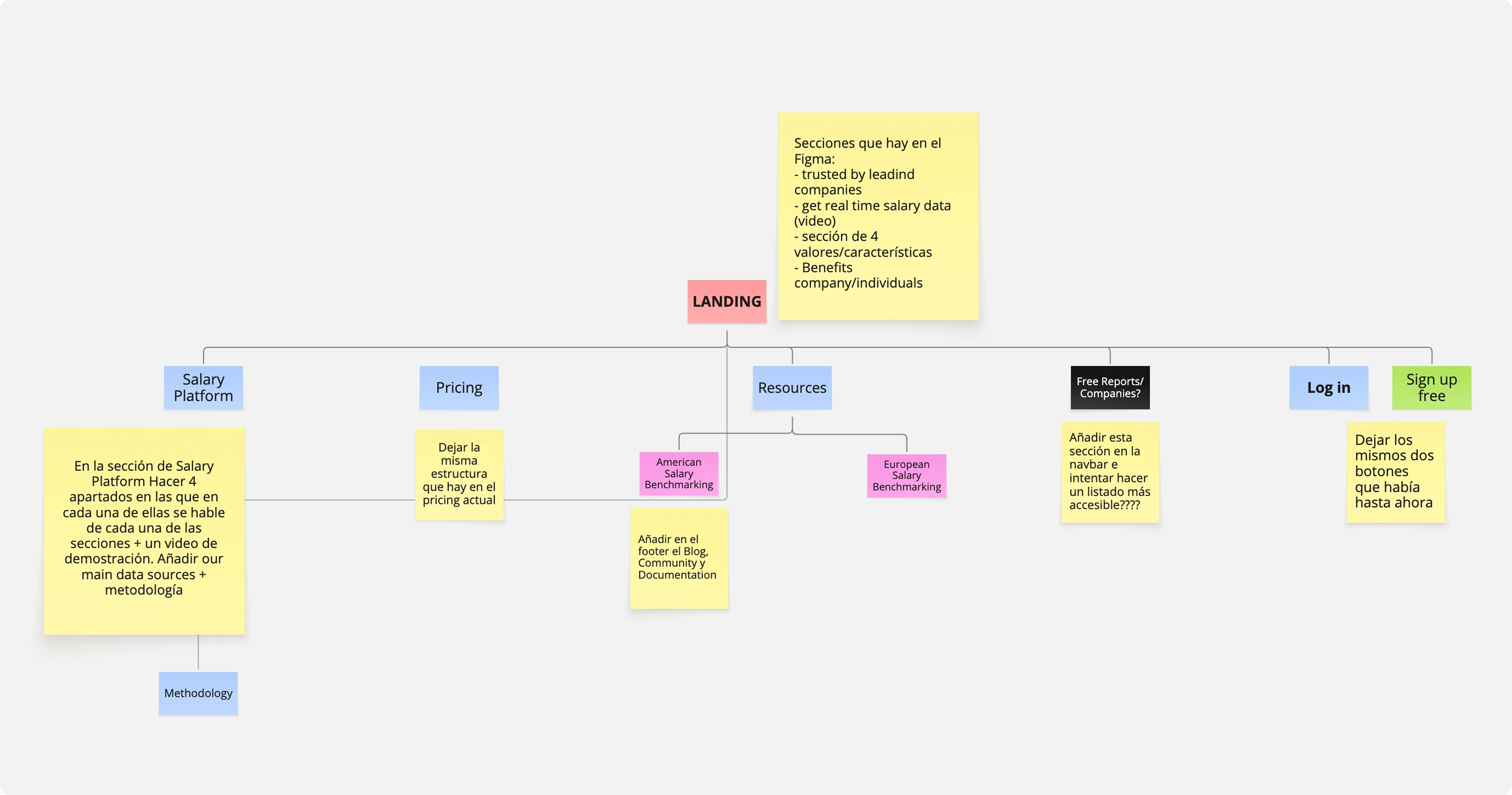
Information architecture — mapped in Miro to align pages, flows, and SEO goals
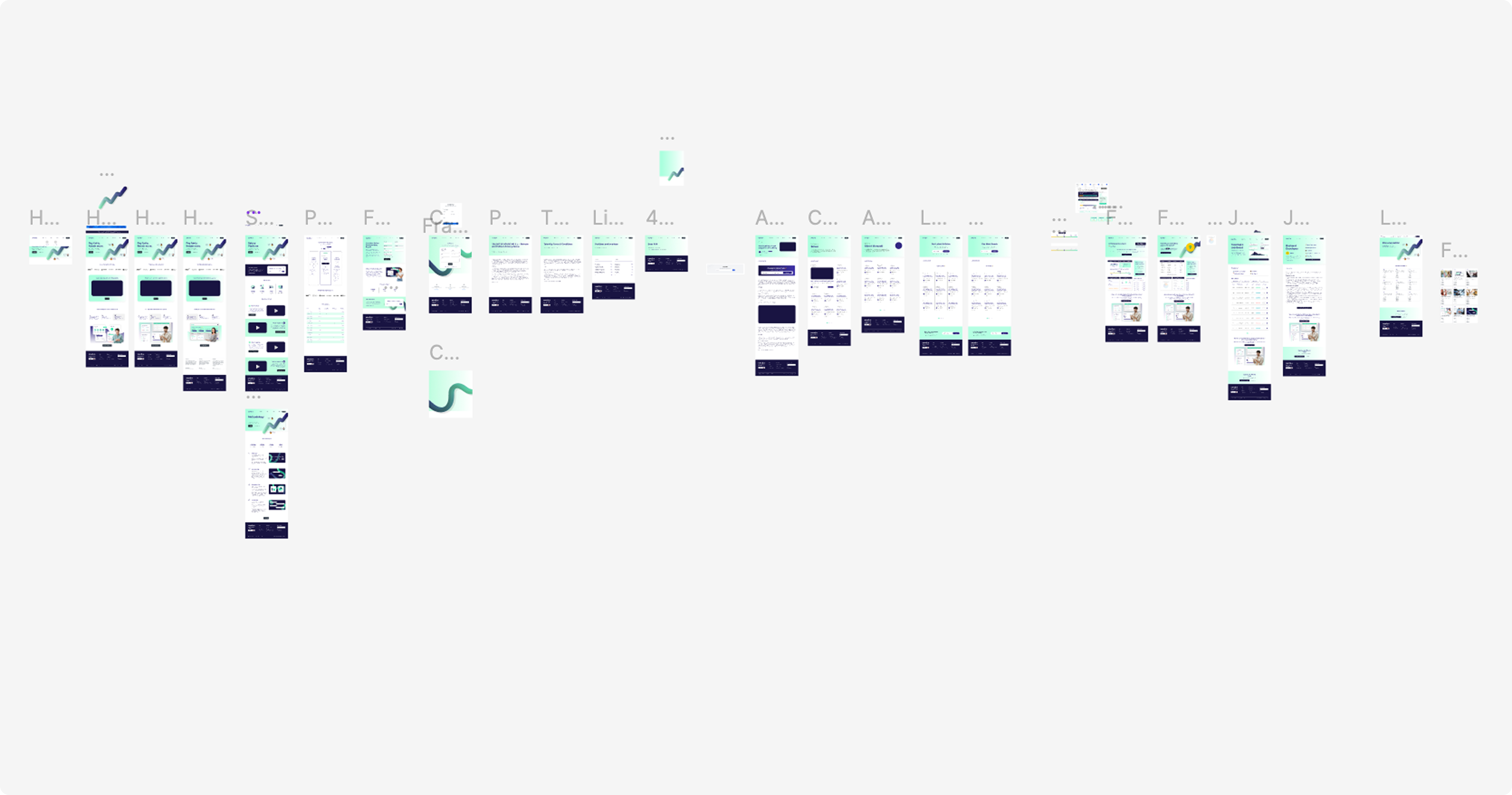
Design system in Figma — reusable components adapted from Preline (Tailwind)
05 — Implementation
I built ~80% of the frontend
We rebuilt the website from the ground up with clean, semantic HTML/CSS — fully responsive and accessible. I implemented approximately 80% of the frontend in close collaboration with the development team, focusing on modular, maintainable structure.
UX writing ran throughout the process: clear CTAs, SEO-optimized copy, and a scalable layout system for content marketing. Every page was validated for cross-browser compatibility and performance.
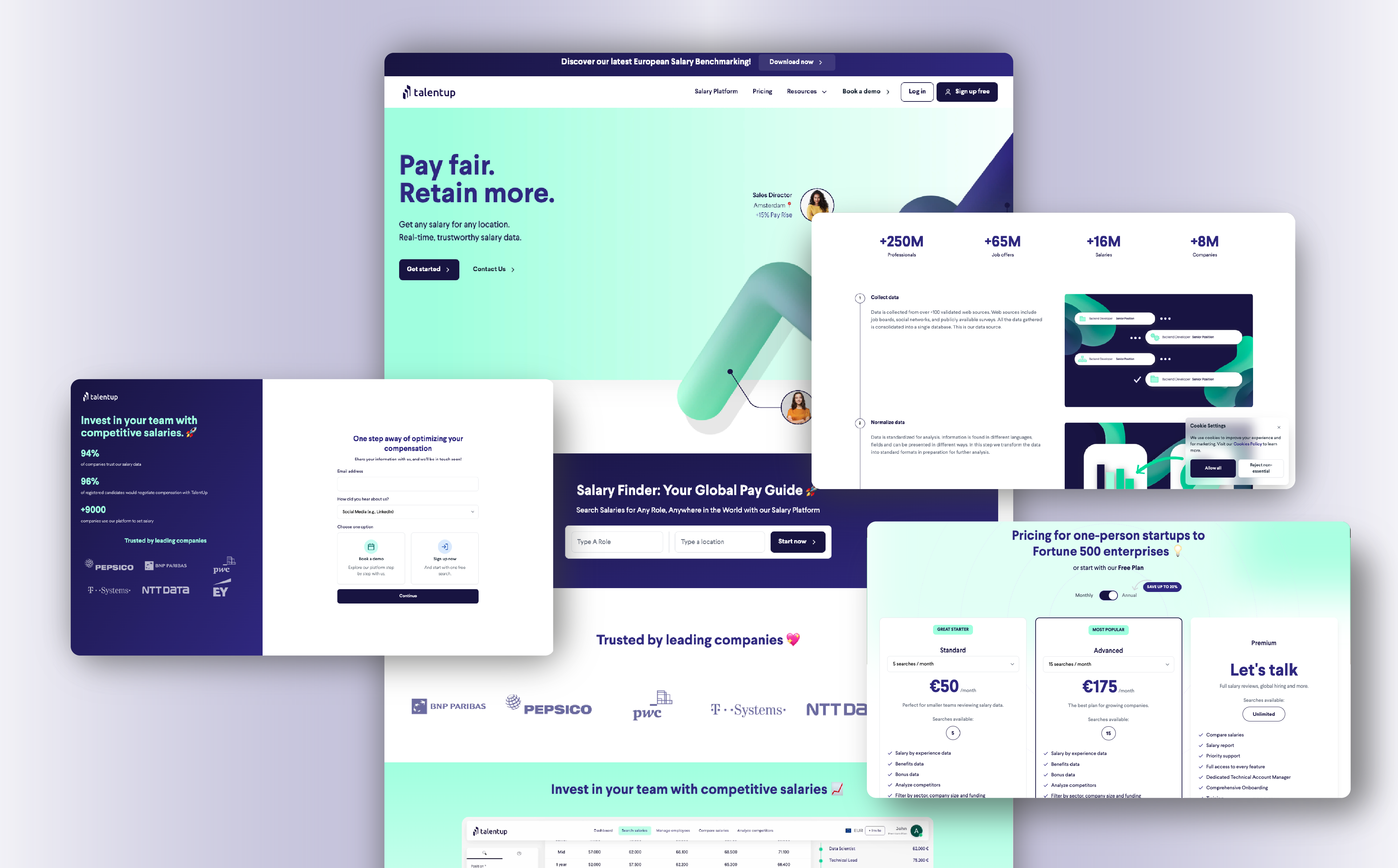
Homepage and product pages — final responsive implementation
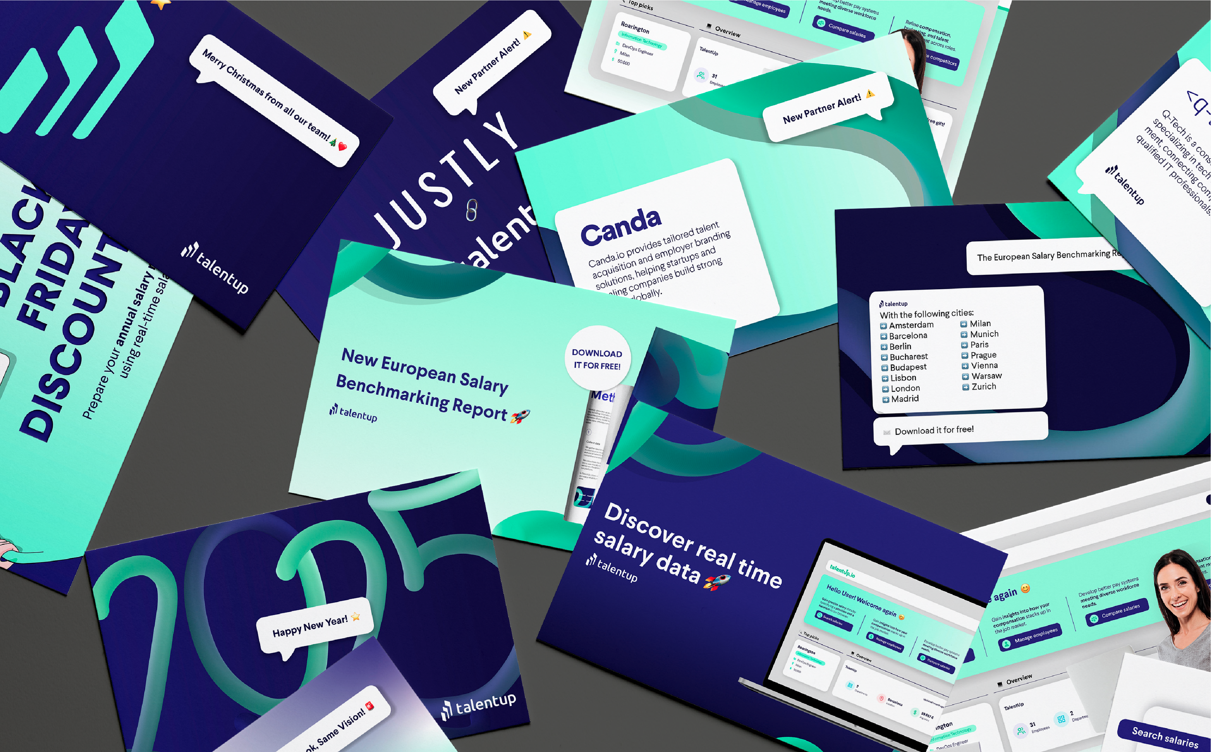
Supporting pages — pricing, about, and content marketing layouts
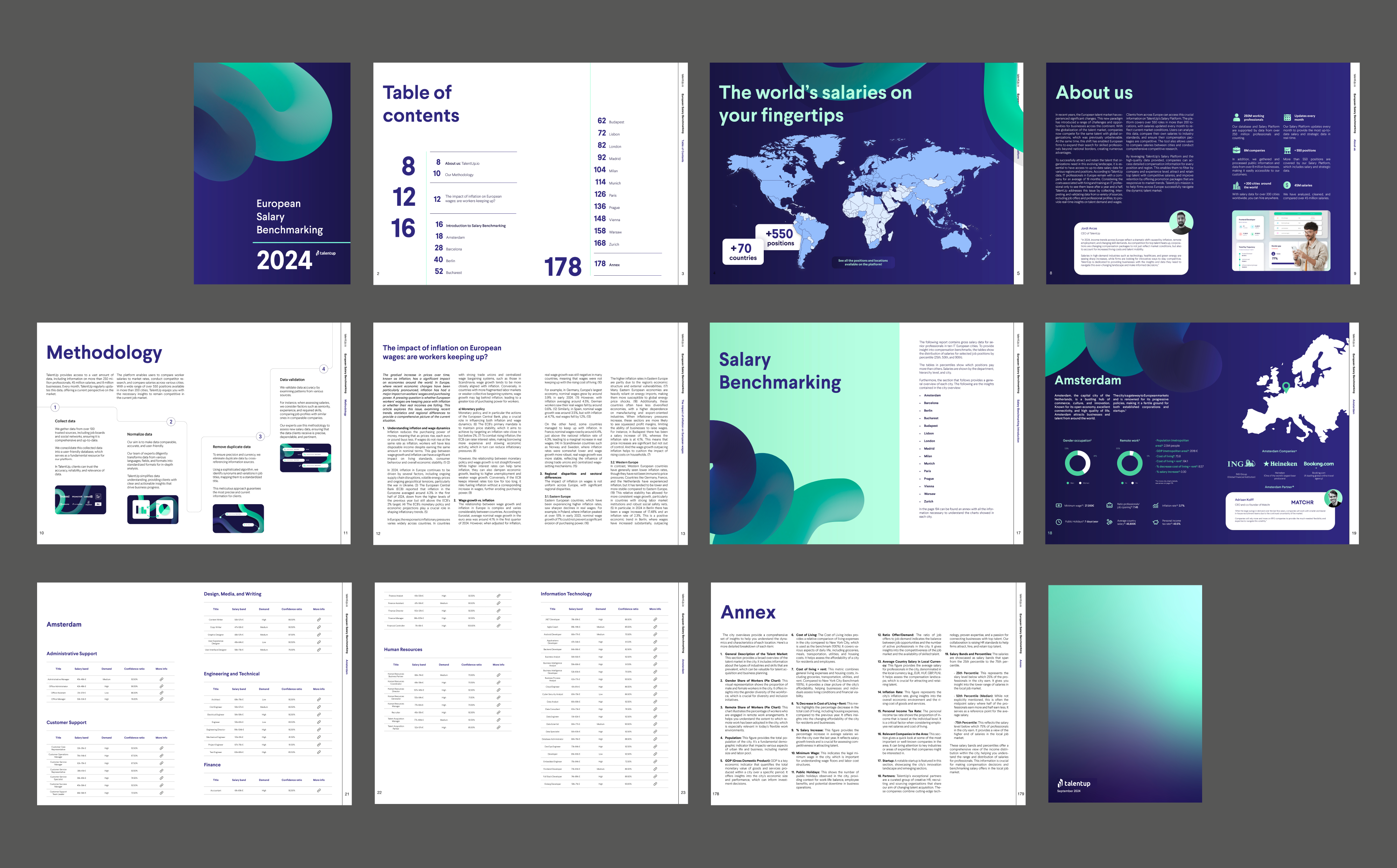
Full BrandBook — from logo construction to digital component guidelines
06 — Outcome
From broken identity to a bold, confident presence
This project gave TalentUp the credibility it needed to grow in competitive SaaS markets. From a broken, outdated identity to a cohesive, professional presence — every channel now tells the same story.
+60%
website traffic in first 3 months post-launch
~80%
of frontend built alongside the dev team
100%
brand consistency across all channels post-launch
07 — Reflections
Going from 0 → 1 on both design and code
This was one of the broadest scopes I've handled — brand strategy, visual identity, UX, and frontend all in one project. Here's what I carried forward.
Translate abstract values into real design decisions
Brand values like "global" and "reliable" needed to become specific font choices, color weights, and layout decisions — not just words on a brief.
Build scalable systems that save time in the long run
Investing early in a design system — before the first high-fidelity screen — paid off enormously during implementation and future iterations.
Make confident decisions under pressure
With brand, UX, and code all in scope, fast and well-reasoned decisions mattered as much as the quality of individual outputs.
Balance aesthetics with maintainability
Beautiful code that no one can maintain is a liability. Every implementation choice considered the next person who'd have to work with it.
Collaborate across marketing and engineering
Bridging design, marketing, and development required clear communication, shared documentation, and a willingness to adapt decisions based on technical constraints.