Design Challenge
Savio
Save wiser, not harder.
AI-Powered Savings Experience for the 24–30 Generation.
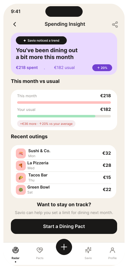
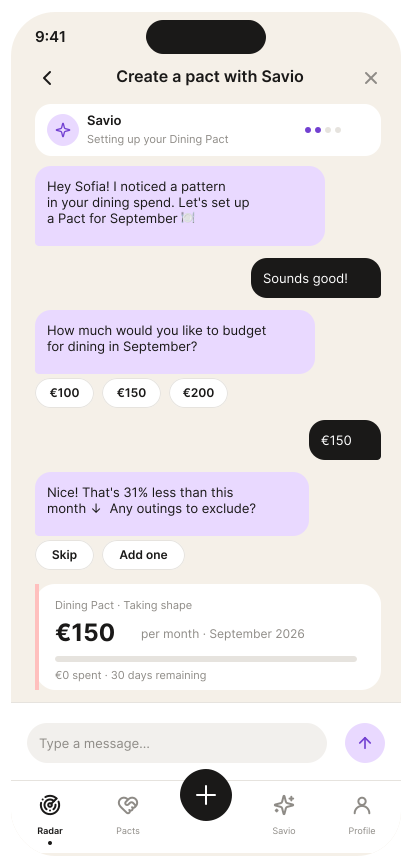
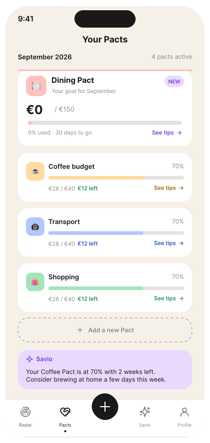
TL;DR
Savio is an AI-powered savings app designed as a BJAK design assessment. I defined the full product concept, designed the mobile UI and component library from scratch — built around one key insight: young professionals don't save not because they lack willpower, but because they lack real-time clarity on what's safe to put aside.
01 — Problem
Not willpower. It's clarity.
Young professionals don't save not because they lack intention, but because they lack real-time information on what's safe to set aside without disrupting their life.
The Problem
Not willpower.
It's clarity.
Young professionals don't save because they lack real-time information on what's safe to set aside without disrupting their life.
The User
24–30,
digitally native
- First stable job
- Uses Revolut for travel
- Has savings goals, no system
- Expects polished mobile UX
The Insight
The gap is information.
When people know exactly what they can spare right now, they act on it. Uncertainty, not discipline, is the real enemy of saving.
02 — Concept
A savings radar, not a dashboard to check.
Instead of asking users to fill in budgets and set limits, Savio reads patterns, surfaces pain points proactively, and creates a Pact with you — a commitment on your own terms, not a restriction imposed on you.
A savings radar, not a dashboard to check.
Radar
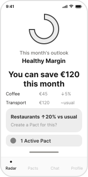
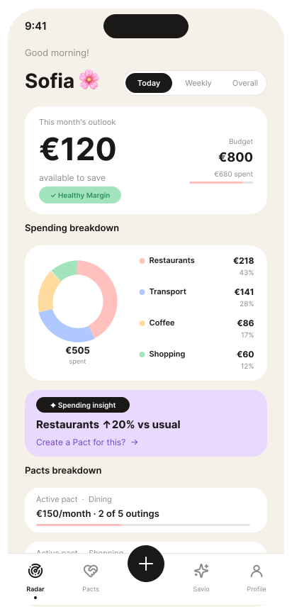
Your month at a glance. Spending breakdown, savings margin, and AI-surfaced pain points.
Pacts
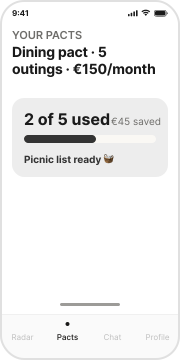
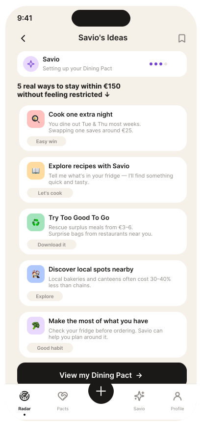
Your active commitments. Every pact you've made with yourself, with progress and creative suggestions.
Chat
Where Savio talks to you. Proactive insights, creative ideas, and a space to ask anything about your money.
Profile
Your preferences. Categories, seasons, goals, and the account Savio needs to help you.
Not a limit. A pact with yourself.
A Pact is a commitment you make on your own terms — how often, how much, how creative you want to be about it. Savio doesn't restrict you. It helps you keep the promise you made to yourself.
How Savio speaks
Tone of voice was a product decision, not a copy choice.
Empowering
We avoid
"You've exceeded your limit"
Savio says
"You're 3 dinners into your pact this month"
Companion
We avoid
"Spending too much on restaurants"
Savio says
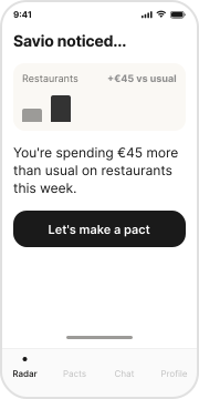
"Restaurants are up 20%, want to make a pact?"
Creative
We avoid
"Try to spend less"
Savio says
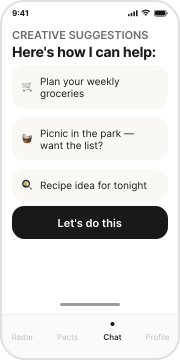
"Your next plan: a picnic in the park. Want the list?"
Conversational
We avoid
"Please set your monthly budget"
Savio says
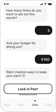
"How much do you want to spend? Go ahead."
Product decisions & trade-offs
Focus over features
We solve ONE problem deeply — savings clarity — rather than building a complete finance app. Depth beats breadth.
AI that acts, not waits
Savio's AI is proactive. It reaches you when it has something useful. It doesn't wait for you to open the app.
Action over information
Every AI insight has one recommended action attached. No data dumps. No dashboards to interpret.
03 — Moodboard
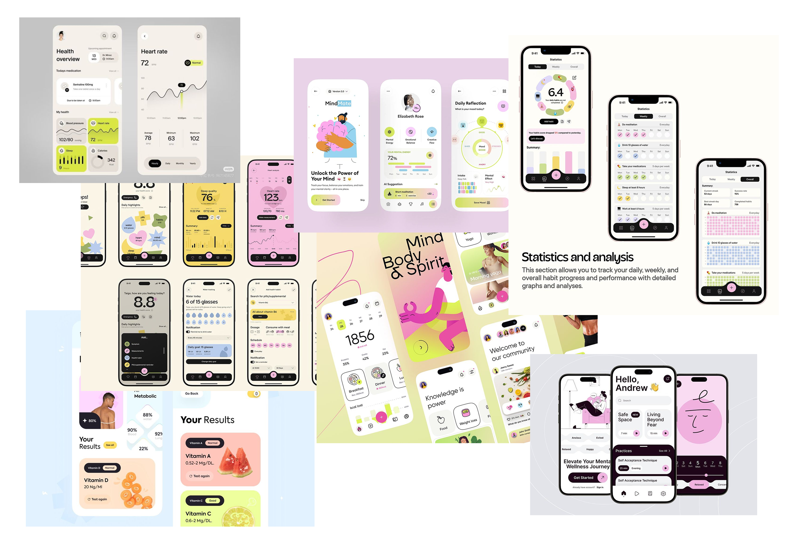
Visual references & direction
Before touching Figma, I mapped the visual territory — apps with warm, approachable UI, strong data visualization, and a calm financial aesthetic. The moodboard shaped the color palette, type scale, and interaction feel of Savio.
04 — User Flow
From insight to action.
The core journey starts when Savio detects a spending anomaly and guides the user into locking a Pact — a conversational, low-friction flow. Behind it, the AI loop continuously learns and refines suggestions with every interaction.
Core Flow
The AI Loop
patterns
pain points
a Pact
acts
adapts
↩ feedback loop — Savio refines suggestions with every interaction, creating a personalised experience
Onboarding (not designed)
Connect Account
Bank authorization via Open Banking API
AI Calibration
Savio analyzes recurring patterns & margin
05 — UI Kit
Design system built from scratch.
I defined a full component library for Savio — foundation colors, category palette, typography scale, and reusable components including cards, buttons, segment tabs, category rows, and chat bubbles.
Foundation Colors
bg
#F5F0E8
surface
#FFFFFF
primary
#1A1918
text-sec
#8E8B86
border
#E6E3DE
Category Colors
dining
transport
coffee
shopping
AI / Savio
Typography
InterButtons
Segment Tabs (pill)
Active: Today
Category Row
Restaurants ↑20%
Transport on track
Coffee ↑5%
Cards
This month's outlook
€120
available to save right now
Healthy MarginSavings hero card
Restaurants ↑20% vs usual
Create a Pact for this? →
AI insight card (lavender)
Dining pact
€150 /month
Pact progress card
Chat Bubbles
Bottom Navigation
Pact Progress Indicator
2 of 5 outings used (dining color)
06 — Screens
Five screens, one coherent flow.
The core user journey moves from awareness to action: Radar surfaces the insight → Insight explains the anomaly → Chat sets up the Pact conversationally → Creative Suggestions offer real alternatives → Pacts Tab tracks progress with ongoing nudges.
AI features
Five AI-powered features, each with one specific job.
Subscription audit
Spots recurring charges you've stopped using and asks if you want to cancel them.
Habit patterns
Detects spending spikes in categories you define and suggests concrete actions. You set the thresholds, AI adapts to your habits.
Seasonal planning
You define your seasons and goals. Savio checks in ahead of time and adjusts savings targets based on your plans.
Dining tracker
Flags when eating out has exceeded your usual weekly baseline, before it compounds.
Smarter grocery
Suggests weekly meal planning when delivery orders are eating into your savings room.
07 — Reflections
What this project taught me
Savio was a design challenge with a tight brief and no existing product to inherit. Every decision — from product strategy to component naming — had to be justified from first principles.
The North Star
A user acts on their first AI suggestion within 3 days of onboarding, no manual setup required.
Not how many users download the app. How fast Savio earns the right to be trusted.
Depth beats breadth — always
Solving one problem well is harder and more valuable than solving five problems adequately. Focusing Savio entirely on savings clarity forced sharper decisions at every level.
Tone of voice is a product decision
Defining how Savio speaks before designing the UI shaped every screen. "Empowering" vs "restricting" changed the entire flow architecture.
Proactive AI changes the design paradigm
Building for AI that reaches out rather than waits to be queried requires rethinking navigation — from "user-initiated" to "AI-initiated, user-confirmed."
A north star metric clarifies every trade-off
"A user acts on their first AI suggestion within 3 days" resolved every feature debate. If a feature didn't serve that goal, it didn't ship.